Enhance Your Kitchen Decor with Art!

by Fulcrum Gallery Staff 17. December 2014 08:58

Selecting the right type of kitchen art is a daunting yet exciting experience. You want your kitchen to stand out and have a concise style that makes it differ from the rest of your home decor. It is a little challenging trying to find the perfect piece to put and the best spots to put it in the kitchen. Finding the perfect piece of art to hang usually is difficult because most likely, you have appliances of a certain color already in your kitchen. This could also make it easier because you now have a specific color to shop for. If you have one specific bare wall in your kitchen, or a place you want to replace with art, try these tips and styles of art to give it an artistic boost.

Old World

Old World Rooster - Kimberly PolosonThe old world look is beautiful for a kitchen that has soft earth tones and dim lighting. Light brown or cream walls with a cherry wood dining table and chairs is extremely flattering for this style. Kimberly Poloson is one of the many artists who create old world prints that would specifically look great in the kitchen. Some of these prints, like Old World Rooster and Vintage Bouquet I- Mini have a main image in the center of the piece, then have a intricate monochromatic boarder with patterns that help the center image pop. Including these images in your kitchen decor will add a vintage feel that will make you kitchen truly unique.


Traditional

Winter Apples - Pauline Eble CampanelliA light and airy traditional kitchen needs some accents that bring out its color palette. If your kitchen is white with beautiful pastels, why not opt for some lovely botanical prints? Photographs and paintings of daisies, poppies, sunflowers, and water lilies are eye pleasing and would look wonderful on a blank wall near the dining table. If you already have a lot of patterns in colors in your decor, botanical prints are a great way to add more decor without clashing with what is already in your kitchen. Pauline Eble Campanelli is one great artist who creates many pieces perfect for kitchen decor. A lot of them are simple and elegant with a solo basket on the table filled with fruits or plants. These prints are one example of adding a perfect touch to an already traditional styled kitchen or transforming your kitchen's decor to traditional style.

Contemporary 

Sliced GrapefruitContemporary kitchens are usually sleek and sophisticated with two main colors for the theme and a few stainless steel appliances. It may be tricky trying to figure out what art style would match with this type of kitchen‘s appeal. A great place to start looking for contemporary art for your kitchen is in contemporary food prints. These prints range from paintings of fruits, coffee, wine, spices, and much more! Contemporary food art is also a great place to start looking because within this style category you can find art to fit your theme. For example, there are many prints that are Tuscan themed, educationally themed, and more!


These are just a few ideas that bring out the styles of kitchens. Kitchen art can be as colorful or as simplistic as you choose. Remember to choose a finish like laminate, frame or canvas, that will protect your art from stains and water damage. Check out our website to browse through hundreds of art pieces to find the perfect art that compliments your kitchen decor!


Great Abstract Art: A Look at Artist Maeve Harris

by Fulcrum Gallery Staff 17. October 2014 08:39

Maeve Harris Jetty 1

If you are a fan of abstract paintings, there is a good chance that you’ve at least heard of artist Maeve Harris. For those that have not heard of her, please allow us to make the introduction. She is a versatile, Seattle-based phenomenon that’s known for her intuitive use of organic forms and blending techniques. In addition, she tends to incorporate elements of photos, literature and history into her work. Here’s a look at several excellent examples of her innate talent:

Maeve Harris Collection: Moment Series

Maeve Harris’ Moment Series is a prime example of her brilliant use of brush strokes to create the illusion of movement. The paintings in the series are appropriately titled Moment I and Moment II. In both instances, she blends blacks, whites, yellows and browns to create two distinct, abstract focal points. Because of their abstract nature and coloring, the paintings could very easily be used in a variety of settings.


Maeve Harris Collection: Jetty & Crème Series

Understandably, Maeve Harris does not restrict her color palette to the ones found in the Moment Series. She has two series that would be ideal for use in beach homes or areas ripe with cool tones. Those two series are Jetty and Crème. Each abstract painting in the two series incorporates white and off white colors. The Jetty Series, however, also infuses those colors with shades of blue and green. As such, all four paintings would look wonderful paired with natural items like pressed seaweed, sand sculptures, bowls of beach glass and driftwood fragments.

Maeve Harris Caballo del Negro I

Maeve Harris Collection: Floral Paintings

No discussion of artist Maeve Harris’ work would be complete without a mention of her floral paintings. She has several collections that focus on flowers. Among the flowers highlighted in the various collections are marguerites, orchids, chiaroscuros and roses. Colors used in Harris’ floral paintings vary greatly. Therefore, it is easy to find one that will fit in with most design schemes.


Would you like to learn more about artist Maeve Harris and her exceptional paintings? If so, stop by the Fulcrum Gallery today.

Popular color trends: Stay gold

by Fulcrum Gallery Staff 10. October 2014 08:20

Bliss by Harold Feinstein

Everyone loves popular color trends when they decide to remodel their home or renovate! It's fun to change your decor every once in a while to keep up with current popular color schemes. A very popular color for home decor, especially for this autumn season, is gold. Gold represents a meaning of success, achievement, and triumph. We often associate the color gold with money or wealth, but the color gold has so much more to tell us than just wealth. Many people have linked the color gold as a way to feel empowered and choose to think gold can give off a vibe of positive energy. Some also believe that gold can bring good wisdom, understanding, and enlightenment.

 Represents a Meaning of Success, Achievement, and Triumph!

Often we see gold metals for the winner of a race so we connect the color gold and it's meaning to the winner's metal. This color draws attention to itself, it is eye-catching, passionate, and confident. Gold is a color that is often overlooked when choosing decor because of the flashy and wealthy vibe it shows. Decorating an office with gold art, or neutral colored prints with a gold frame, can give one a sense of empowerment and success. Getting gold art, art with a gold frame, or art on canvas with gold painted sides is not only suitable for your office. These will also raise your feeling of success in a library or study room. 

Perfect Decor for Autumn Season!

Gentle Rise by Douglas Aagard

Not only is gold great decor for offices, classrooms, libraries, and study rooms, but it is also great for general home decor during autumn season! Decorating your home with paintings and photographs of golden autumn trees and the golden kissed sky during sunset is a great way to bring the beauty of autumn into your home with out having crunchy leaves. Gold autumn decor helps a room pop with color and come to life. Golden touched autumn art is especially a great decor choice for those who find themselves who favor autumn over other seasons. If autumn season is your favorite, why not leave the autumn decor up year round to keep your favorite season around!

Although gold is a popular color to decorate, you want to make sure to not overdo it. Having too much gold decor in your home can be overwhelming since gold is such a bold color. If the room is painted a solid color that compliments gold, just decorating with gold is perfectly fine! But remember, gold is a loud color that does not need help standing out and making a statement. Too much gold decor can ruin the statement you want to make. If done correctly, gold decor can be the perfect inspirational art, or the perfect seasonal art!

Time to Decorate for Fall

by Fulcrum Gallery Staff 26. September 2014 13:12

Autumn Leaves Great Smoky Mountains National Park NC USA

Fall is almost here! As the temperature drops and the days grow shorter, nature follows suit with a change of colors. Yellow, orange, gold, rust and red take over the landscape, diffusing autumnal spell. An irresistible spell. A spell you want to bring inside your home and spread the magic all around. Here’s how you can bring the colors of fall into your home:

Celebrate the Colors of Fall

Fall means the orange of pumpkin, the red of corn, yellow of gourds and the rust of fallen leaves. Often, they don’t come in one shade but myriads of shades and hues – a subtle yellow, a bold red or deep burgundy. Fall celebrate colors, perhaps nature’s way of cheering the beginning of colder weather. Fall colors are warm and inviting and what better way of duplicating these hues than inviting them into your home. How? By using fall art and prints that capture the essence of the season. For instance Bright Autumn Day showcases trees touched by the glow of orange and red while Autumn Embers captures a more subdued autumn. What you pick depends on the mood and feel you’re going for.


Yellow Maple

Celebrate the Season 

In America, fall calls for celebration – pumpkin patch, hayrides, harvest fest, Halloween and Thanksgiving. Often, fall décor is employed to amp up the ambience. Apart from using pumpkins and gourds and fall flowers to build the atmosphere, consider using fall art and prints to add layers of interest. Transform the kitchen into an autumnal landscape of irresistible warmth and colors. Consider pictures of fall harvest such as playful Sharing the Harvest or thoughtful Harvest Blessings. Choices abound with pictures of wine, olives, prairie landscape and Tuscany harvest. 

Celebrate Fall One Room at a Time

Think of how many ways you can use fall décor and how many places you can go with that. We’re talking rooms in your house. The kitchen may be the most obvious place to deck out fall décor but don’t limit your fall magic to just one room. Cozy up your family room with autumn flowers or autumn landscapes or abstract art. Or the living room or the den for that matter. Follow your fancy and allow fall magic to invade your living spaces.

Use art to celebrate fall in all its glories!

Use Black and White Art to Create Your Dream Bedroom

by Fulcrum Gallery Staff 18. September 2014 14:34

Have you ever wanted with two simplistic yet intense colors? Most decorators will agree that the colors to do this job are black and white, two colors that are stark against each other. They are complete opposites in the color scheme, yet they work together cohesively to create a huge impact. When working with black and white, consider the effect you want to create in the room. You’ll be surprised at how many different ways you can go: sophisticated, chic, minimal, classic, cozy or vintage. Using black and white art is one great way to achieve that effect, here's how:

Black & White Art

  • Modern Black and White Art

A modern bedroom is all about sophistication and clean lines. It’s sleek and chic. Consider using cleverly chosen black and white art. From a single bold piece of art to a collage of black and white art, the effect can be stunning and dramatic. Whether it’s the clean lines and shades or the juxtaposition of the two bold colors, using modern black and white art can transform your bedroom into a modern haven of good taste.

  • Vintage Black and White Art

Vintage is the rage these days. If you’re dreaming of transforming your bedroom into a vintage showcase, consider the use of vintage black and white art. From throwback to the good old days of baseball to iconic moments in history to famous movie stars, the choices are astounding. Go with a theme or create a feel with these visual pieces.

  • Black and White Photography

Perhaps you’re a photography buff or a fan of black and white photography. You’re in good company. Black and white photography adds interest, appeal and a soft, understated, yet powerful effect. Scenery, places of interest, portraits lend themselves to that effect, though black and white photography is not limited to these categories. Use black and white photography to create a calming, soothing effect or to create a cozy getaway from the day’s hustle and bustle at the end of the day. A bedroom to soothe the soul, the perfect retreat.

Black & White Art

Decorating your bedroom with just two colors will not be boring with a little know-how and imagination. Use as little or as much of the black-white combo and let the colors do the talking. You may also opt to add drama with an introduction of a third color but the call is entirely up to you. 

Prepare for Mother Nature’s Annual Show with Autumn Art

by Fulcrum Gallery Staff 14. August 2014 16:26

Before long, that old familiar nip will be in the air and leaf peeping season will be in full bloom. Personally, we’re looking forward to it, are you? If so, may we suggest that you prepare for the season by decorating your personal space with autumn art? In our experience, there is no better way to get ready for Mother Nature’s amazing show than that.

 Matthew Sievers Saturated Reflections Matthew Sievers’ Autumn Art

Matthew Sievers is one creative soul whose autumn art would be perfect for contemporary interior designs. His Seasons and Saturated Reflections wall art are truly unique. When stared at long enough, they almost make viewers feel as if they’ve been transported into the autumn woods. Sievers is also known to celebrate the change of seasons in his autumn art with giclee, stylized flowers, impasto, reflections and two-tone design elements. So his work would add quite a bit of visual interest to an otherwise drab space.

Lynn Krause’s Autumn Art

 James Wiens Autumn Forest I If you are looking for autumn art that has the warm colors of foliage front and center, pastel artist Lynn Krause’s work may be a good choice for you. She has an entire tree series that collectively shines a spotlight on the way that leaves change their colors. Some of her artwork, like Autumn Stream and Bright Autumn Day II, feature vivid yellows and oranges that are likely to really brighten up a place. Thus, you may want to put them in a bedroom or hallway with access to the outside.

James Wiens’ Autumn Art

Do you prefer the look of oil on wood or canvas instead of pastel and paper? Well then, work by contemporary artist, James Wiens may be more to your liking. He has two series of note, Autumn Trees and Autumn Forest. Both focus on fall foliage. However, the colors used in the paintings are much more subdued than those found in other artists’ work. Therefore, it would be feasible to hang them in rooms filled with early American furnishings.

To learn more about these artists’ work and find the ideal autumn art for your personal space, please visit Fulcrum Gallery.

Why Not Consider Decorating with Pop Art Featuring Andy Warhol?

by Fulcrum Gallery Staff 6. August 2014 10:34

http://www.fulcrumgallery.com/a24594/Andy-Warhol.htm

At its inception, the pop art movement brought relief to those that had grown tired of works created by abstract expressionists. From there, it went on to become one of the most popular art forms of the rebellious 50's and free-wheeling 60's. Today, designers’ passion for decorating with pop art featuring Andy Warhol helps to keep the love affair going.

Brooklyn Bridge in Orange and Blue by Andy Warhol

Warhol, for those readers that may have not been around during the early pop art movement, was born in the 1920's and died in the winter of 1987. His work was renowned the world over. The colorful, iconic images that he used helped to convey what was going on in pop culture, whether the activity was ultimately controversial or not. As such, his artwork often stirred strong feelings in fans and critics alike.

When decorating with pop art featuring Andy Warhol prints, there are several schools of thought to consider. For instance, some interior designers like to display Warhol’s art in areas that match the picture’s subject matter. Others prefer to put the artwork in unrelated, unexpected spots that help jolt viewers out of their rote activities. There are also those that focus more on the colors and patterns inherent in Warhol’s artwork than the actual subject matter.

Daisy by Andy WarholTake Andy Warhol’s Knives, c.1981-82 picture as an example. It could be hung up in a contemporary dining room or kitchen that has pops of black and cream coloring throughout. On the other hand, it could also be placed in a study or office with his series of Guns artwork and Skull, 1976 to show a love of mystery novels and forensic sciences.

There are other Andy Warhol prints on the market today that feature the artist’s quotes and images. One of our favorites is the one titled, Think Rich, Look Poor. It would look great on display in a bedroom changing area or walk-in closet. As would prints like It Takes a lot of Work to Figure Out How to Look So Good, Diamond Dust Shoes and Two Female Fashion Figures c. 1960.

To learn more about decorating with pop art featuring Andy Warhol, please contact us today. We have many prints of the artist’s work in stock as well as several other pop art prints of note.

For the Love of Word Art From Barn Owl Primitives

by Fulcrum Gallery Staff 31. July 2014 13:13


Barn Owl Primitives started out small. Christi, the creator, started out making handcrafted Christmas gifts, specifically hand-painted, door-hanging snowman, when money was tight. Friends and families became her first customers but, then, the word got out…and friends of friends started placing orders as well. Since snowman is rather synonymous with winter, Christi started other ideas that weathered seasons: word art that are perennially appealing. Barn Owl Primitives was born and “signs to decorate your life” becomes her signature motto. Since then, her Barn Owl Primitives has birthed various categories of word art:

http://www.fulcrumgallery.com/Barn-Owl-Primitives/Playroom-Rules_736272.htm?sku=R736272-AEAAAAAAE4

Family Rules

It’s true every family has its own rules, but some rules seem to be universal. Short of repeating yourself often, it would be neat to have these rules written out and place in strategic places as reminders. Need help to maintain order in the playroom? Enlist the help of Playroom rules word art – all the gentle reminders conveniently placed on the canvas (or neatly framed) – a great way to reinforce rules without nagging. How about kitchen rules? Barn Owl has a series of that too: Sit up Straight or simply entitled “Kitchen.


Encouragement

We could all use a little “pep” talk now and then, a little pick-me-up encouragement. What better way to motivate yourself or others than a word art décor? Whether you want to be brave (or reminded you’re brave), strive to be real or just want to love and be loved, Barn Owl primitives have a range of selection to cater to your needs.

http://www.fulcrumgallery.com/Marla-Rae/Be-More_706969.htm?sku=C706969-ACDAAMA

Holiday Signs

Want to create a festive mood? Or get into the holiday spirit? Holiday word art can help you do that without really trying too hard. Hang one up and allow the magic to diffuse the room with that seasonal joy and longing, a little nostalgia or warmth. Christmas, Halloween or just to welcome a new season, take your pick. Order up some holiday cheer, it's that time of the year.

http://www.fulcrumgallery.com/Barn-Owl-Primitives/Soccer_735913.htm?sku=R735913-AEAEAGMFDM

Sports

Know a husband, a father, a son, a brother or a friend who loves sports? They live, eat and breathe sports and you may experience a little neglect when the sports season is on? They would love one of the word art on sports. Football or soccer, these word art will make great gifts for sports fans.

Using Barn Owl Primitives word art for decor is a great way to add character, swag or mood. Buy them for yourself or to give away as gifts. Feel free to browse our website or contact us for more information.

World Culture Art: Tuscany in Your Home

by Fulcrum Gallery Staff 10. July 2014 09:40

Warm up a rustic kitchen or family room with the earthy hues of Tuscany. From neutral wall paint colors to cultural art, you’ll feel like you’re relaxing in a foreign land. The best part of travel art is that it creates a home that is both cozy and worldly.

Tuscan art for your Kitchen

http://www.fulcrumgallery.com/Loran-Speck/Italian-Feast_29493.htm?sku=R29493-AEAAAAGAE8

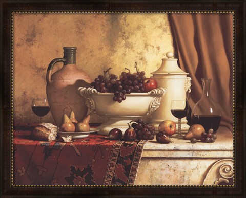
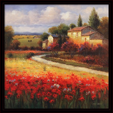
When decorating the kitchen with travel art of Tuscany, focus on images of wine bottles, grapes, apples and lemons. Or go for the bigger picture with a garden landscape. The blue skies in garden art complements the warm brown and orange tones of the Italian landscape.

Decorating ideas:

* Clay tiles, from your local home improvement store can be used as a back splash, or use the individually as drink coasters.

* Wooden decorative objects in the shape of pears, pepper mills or wine bottles add to ambiance.

* Try your hand at decorating a small area with a leafy green stencil. Keep linens including table settings and window treatments in off-white hues.

* Upgrade cabinet hardware French Country knobs and handles.

Black wire baskets and candle holders finish out the Tuscan look in your kitchen.


Tuscan Living Room

http://www.fulcrumgallery.com/Ben-Harris/Tuscan-Summer_640679.htm?sku=R640679-AEAAAAEADM

For a Tuscan theme, consider your rooms with beige or golden mustard walls. For pops of color in the room, use large golden yellow or burn orange candles.

Add details to every corner:

* Use small garden statues as bookends.

* Spice up the room with coffee-colored furniture or decorative objects.

* Decorate the largest wall with multiple pieces of Tuscan art.

* Use small images in wooden frames on shelves and end tables, to resemble personal travel photos.

* Decorate windowsills with leafy vines in stone vases.

* Create a focal point in the room with a tall garden vase to complete the worldly transition.

Shop your favorite Tuscan art today and save 50%! For more information on decorating a with culture art, please contact us

Mark Rothko: The man behind the rectangles

by Fulcrum Gallery Staff 24. February 2014 12:01

Anyone who spends much time contemplating modernist painting in a museum is bound to hear at least one passerby scoff. "This is worth how much? I could have painted that." Flipping through thumbnails of his color field paintings in an art history textbook, one might at first be tempted to shovel Mark Rothko into this category, but upon experiencing these great works in person, one begins to wonder anew: who was the person behind this body of work, and where did these images come from?

 Mark Rothko Blue, Green and Brown

Born in Latvia in 1903, the Jewish-American painter we know as Mark Rothko immigrated to the United States in 1913 as a result of his father's fear that his sons would be drafted into the Russian Army. They settled in Portland, Oregon, where young Marcus excelled in school, winning a scholarship to Yale University. Uncomfortable in this elitist environment, he never finished, but was later awarded an honorary degree. He eventually became an American citizen and changed his name from Marcus Rothkowitz to Mark Rothko to sound less Jewish, as a response to rising anti-Semitism as the Nazi party gained influence in Europe. After leaving Yale, Rothko subsequently found work in New York where he experienced the turning point into his career as a visual artist. Passing by the Art Students League, a figure drawing session caught his eye, and he began to take classes there and at the New York School of Design. Especially given the economic depression, his family was not supportive of Marcus's decision to become a professional artist, despite his beginning to gain respect within avant-garde art circles.

 Mark Rothko Green, Red, on Orange

Rothko and other artists he associated with at the time feared that American painting had hit a wall, conceptually, becoming equated with the somewhat literal depiction of landscape and urban scenes. Even in this early work Rothko was interested in color as something that human beings respond to on a very basic level, beginning at a very young age. He believed that artistic clarity could be achieved through increasing levels abstraction, but his early work was still somewhat figurative. Rothko's interest in mythology and the writings of Nietzsche became a strong influence on his painting, beginning a quest to lessen the spiritual emptiness of the modern man.

 Mark Rothko Untitled, 1949

Mark Rothko began creating work in what we now consider to be his signature style in the late 1940s. These paintings, which critics termed "multiform paintings," featured rectangular fields of color on a large vertical canvas. Some criticized their large scale as an attempt to compensate for lack of content, to which Rothko replied that the scale was meant to allow the viewer to step close enough to feel part of the work itself. "I want to be very intimate and human. To paint a small picture is to place yourself outside your experience, to look upon an experience as a stereopticon view or with a reducing glass. However you paint the larger picture, you are in it. It isn’t something you command!"

FulcrumGallery

Visit our online store fulcrumgallery.com 

Homepage
FacebookPinterestTwitterGoogle PlusHouzz


We Encourage Stalking

Month List

Calendar

<<  April 2024  >>
MoTuWeThFrSaSu
25262728293031
1234567
891011121314
15161718192021
22232425262728
293012345

View posts in large calendar