by Fulcrum Gallery Staff
15. October 2015 08:47
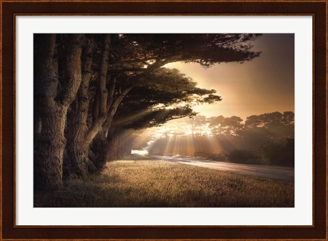
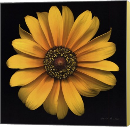
“No Place to fall” is a beautiful, lively photograph taken by none other than William Vanscoy. Vanscoy believed that what was being expressed made photographic art rather than what was being seen. He merged together traditional and digital photographic landscape because he believed it was important to capture the beauty of life and nature.
Style Of Art
William Vanscoy did a wonderful job with making this piece one that is well sought-after. By capturing timeless and detailed scenery, his photographs look as if you are looking at the scenery in person rather than a photograph. Vanscoy uses digital capture and extensive digital post-production to make his photographs. Sometimes he combines multiple photographs to create one realistic image. “No Place to fall” made it clear that Vanscoy did not need to describe or give further explanation to his pieces; he rather lets them speak for themselves. This gives the viewer a wide range of imagination to explore while looking at this photograph. This piece creates a sense of:
· Wonder.
· Serenity.
· Beauty.
· Self-expression.
This photograph is not explained which leaves it up to you to interpret the meaning.
Accenting The Piece
“No Place to fall” is a very bold piece. Although it is a big enough statement on its own, it can easily use small accents when hanging in a room. This piece could go well in any type of room but would work very well in a living room. By using beige, brown or dark tan colors around the room, this photograph will pop even more. Making this the focal point of the room would be a bold choice and really pay off when your guests can’t take their eyes off of it. Pairing the photograph with a beige colored picture frame would contrast with the darkness of the painting and bring out the details of the work.
Unintentional Popularity
Many owners of this piece describe it as “beautiful” and that is exactly what it is. Vanscoy captured this scenery perfectly. Some elements that reflect beauty are:
· The sun shining through the trees.
· The balance between light and dark.
· The extreme detail in the photograph that Vanscoy captured.
· The aspect of serenity.
Because of these elements, there is no question why this piece is so popular. Why wouldn’t you want to have this calming and beautiful photograph in your house or place of work? The only way to explain this photograph to a viewer would be to call it a “statement piece.” You could add other photographs around that complement “No Place to fall” but it could also work well standing on its own. This is such a bold piece; you could have bare beige colored walls with this, as your only hanging piece and the room would be beautiful.
Although the piece could be interpreted many different ways, one thing we can all agree on is the beauty is exudes. With the contrast, realism and serenity of this photograph, it’s no wonder it’s so popular and could work so well in many different settings.
Tags: art for dad, art for kids, art for Mom, art framed, Art Gallery, Art Gifts, art prints framed, art prints, art prints on canvas, Color Photography, featured artwork, featured color, featured color art, flower art, floral art on canvas, flower art for kids, field, field art, fine art, FulcrumGallery.com frames, Fulcrum Gallery, FulcrumGallery frames, living room art, landscapes, photograph, photography, photography on canvas, scenic art, scenic artwork, scenic photography, seasonal paintings, seasonal photography, seasons, seasons art, sepia, sepia art
Featured Artist | Framed Art | Photography | Scenic Art | Spring Art | Summer | Winter Art
by Fulcrum Gallery Staff
8. January 2015 13:11
Black & white photography is timeless. It adds depth to its surroundings and can bring an instant element of class and elegance to a room. However some people shy away from the idea of using black and white photos for decorating, afraid it will look dull and lack creativity. This could not be more untrue. Black and white is the perfect medium for decorating with pictures in any room in the house; even a child’s bedroom. The key is in knowing how to use it.
Tips for decorating with black and white photography:
Tip 1: Black and white photos are ideal for decorating brightly colored walls because they won’t conflict with the surrounding color. Use the same frame style and color for every picture to prevent competition, while drawing one’s eye to the subject of the photo. Solid black or white frames with white matting work well with vivid backgrounds.
Tip 2: Adorn a child’s room with black and white prints of a subject they love. Baseball fans will be thrilled by the variety of vintage shots featuring famous sluggers and well-known stadiums. For a child who adores animals, black and white pictures of puppies, kittens or horses play well against pale blue or pink walls.
Tip 3: Teenage girls enjoy themed decor such as Paris, glamorous movie stars or dance. Paired in brightly colored or black frames against white or cream walls, black and white photos will blend in beautifully with her inspiration.
Tip 4: Neutral colored walls in a living space form the perfect pallet for black and white art. Photos of the beach or ocean framed in distressed white, light blue or natural wood give a special touch to a coastal themed room. A more modern and chic look can be achieved by combining photos in both black and white frames in a beige room with white trim and shelves and black wrought iron wall hangings, candle holders and lamps.
Black and white photos can be dramatic, playful, elegant or glamorous, bringing tremendous beauty and infinite possibilities for decorating to a home. Consider the possibilities in your own home and then browse our large selection of black and white photography.
Tags: black and white art, black & white art, art by color, art for kids, Art Gallery, Art Gifts, art on canvas, art print, art prints, black art, black frame art, business decor, canvas art, canvas transfers, children's art, custom canvas, custom framing, custom framed canvas, custom gifts, fine art, featured artwork, framed, framed art, framed black and white gifts, framed photography, framed vintage photography, framed vintage art, framed vintage posters, Fulcrum Gallery, Gifts
Black & White | Canvas Art | Featured Color Art | Photography | Vintage Art
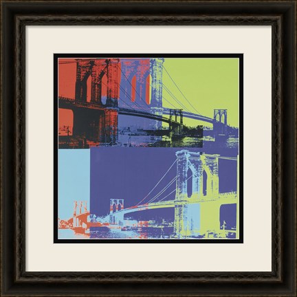
by Fulcrum Gallery Staff
28. November 2014 08:58
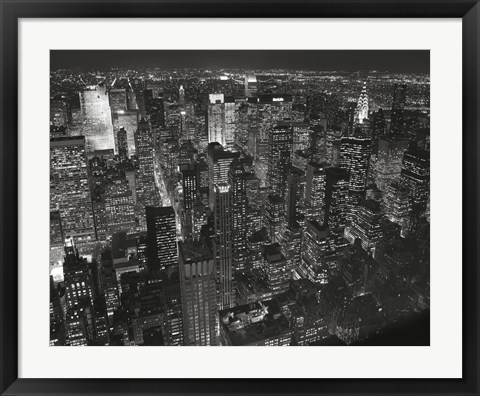
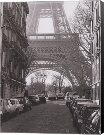
Christopher Bliss's photography is a great addition to any decor style. Growing up in the beautiful city of New York, Bliss's work reflects the architecture and skylines he grew up with. His work is mostly in black and white making the contrast able to work with most decor. The architecture and contrast of the photographs are striking and subtle allowing them to work in any environment. Architecture photographs are able to play off the light in any room, naturally or artificial lit.
You have your choice of scenery in color or black and white and of architecture or nature, and even your choice of city. From a bedroom sanctuary to the busy kitchen, his work can fit right in. If you adore the city or nature, he has art to suit your home. Christopher Bliss finds inspiration in the invigorating city, and you can too with his photographs.
Originally trained as a concert pianist at the Vienna Academy of Music, the Manhattan School of Music, and the University of Southern California, and now turned photographer, Christopher Bliss's art is truly beautiful. Christopher Bliss Photography reflects this as the photographs are as detailed as a piece of beautiful music.
His photography is held in high esteem and he is often sought after. His work can be found in several galleries and even in two separate photography books, one of which is on the beautiful New York City. Some of his work is even in the permanent collection of the Museum of the City of New York.
Tags: photography, framed photography, art for dad, Art Gallery, Art Gifts, art print, art prints, black and white art, black art, bridges, business decor, Cities, cityscapes, fine art, Fulcrum Gallery, Gifts, photos, Christopher Bliss art, Christopher Bliss photography, framed Chris Bliss art
Black & White | Featured Artist | Photography
by Fulcrum Gallery Staff
17. October 2014 08:39
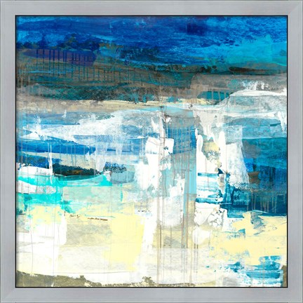
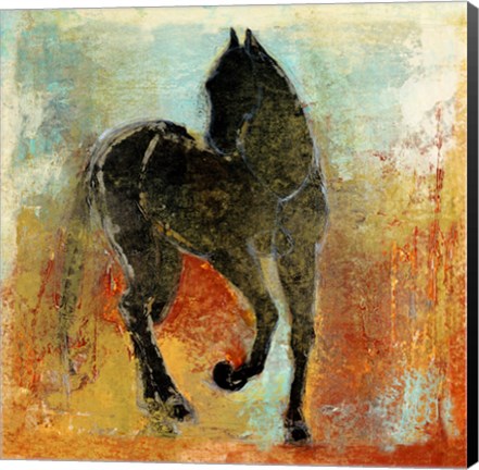
If you are a fan of abstract paintings, there is a good chance that you’ve at least heard of artist Maeve Harris. For those that have not heard of her, please allow us to make the introduction. She is a versatile, Seattle-based phenomenon that’s known for her intuitive use of organic forms and blending techniques. In addition, she tends to incorporate elements of photos, literature and history into her work. Here’s a look at several excellent examples of her innate talent:
Maeve Harris Collection: Moment Series
Maeve Harris’ Moment Series is a prime example of her brilliant use of brush strokes to create the illusion of movement. The paintings in the series are appropriately titled Moment I and Moment II. In both instances, she blends blacks, whites, yellows and browns to create two distinct, abstract focal points. Because of their abstract nature and coloring, the paintings could very easily be used in a variety of settings.
Maeve Harris Collection: Jetty & Crème Series
Understandably, Maeve Harris does not restrict her color palette to the ones found in the Moment Series. She has two series that would be ideal for use in beach homes or areas ripe with cool tones. Those two series are Jetty and Crème. Each abstract painting in the two series incorporates white and off white colors. The Jetty Series, however, also infuses those colors with shades of blue and green. As such, all four paintings would look wonderful paired with natural items like pressed seaweed, sand sculptures, bowls of beach glass and driftwood fragments.
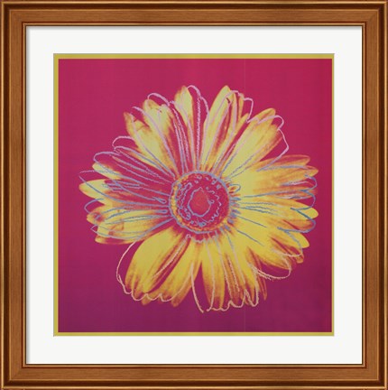
Maeve Harris Collection: Floral Paintings
No discussion of artist Maeve Harris’ work would be complete without a mention of her floral paintings. She has several collections that focus on flowers. Among the flowers highlighted in the various collections are marguerites, orchids, chiaroscuros and roses. Colors used in Harris’ floral paintings vary greatly. Therefore, it is easy to find one that will fit in with most design schemes.
Would you like to learn more about artist Maeve Harris and her exceptional paintings? If so, stop by the Fulcrum Gallery today.
Tags: Maeve Harris Art, Maeve Harris framed art, Maeve Harris art on canvas, canvas art, collections art, framed art, framed collections, abstract art, horse art, featured artist, animal canvas art, framed blue art, blue abstract artanimal gifts, Art Gallery, Art Gifts, bathroom decor, business decor, canvas abstract art, canvas gifts, canvas transfers, color trends, colorful art, contemporary art, contemporary decor, custom canvas, custom framed canvas, custom framing, custom gifts, customized gifts, decorating ideas, fine art, framed
Abstract Art | Animal Art | Featured Artist
by Fulcrum Gallery Staff
10. October 2014 08:20
Everyone loves popular color trends when they decide to remodel their home or renovate! It's fun to change your decor every once in a while to keep up with current popular color schemes. A very popular color for home decor, especially for this autumn season, is gold. Gold represents a meaning of success, achievement, and triumph. We often associate the color gold with money or wealth, but the color gold has so much more to tell us than just wealth. Many people have linked the color gold as a way to feel empowered and choose to think gold can give off a vibe of positive energy. Some also believe that gold can bring good wisdom, understanding, and enlightenment.
Represents a Meaning of Success, Achievement, and Triumph!
Often we see gold metals for the winner of a race so we connect the color gold and it's meaning to the winner's metal. This color draws attention to itself, it is eye-catching, passionate, and confident. Gold is a color that is often overlooked when choosing decor because of the flashy and wealthy vibe it shows. Decorating an office with gold art, or neutral colored prints with a gold frame, can give one a sense of empowerment and success. Getting gold art, art with a gold frame, or art on canvas with gold painted sides is not only suitable for your office. These will also raise your feeling of success in a library or study room.
Perfect Decor for Autumn Season!
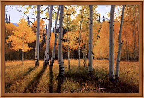
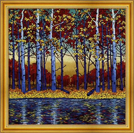
Not only is gold great decor for offices, classrooms, libraries, and study rooms, but it is also great for general home decor during autumn season! Decorating your home with paintings and photographs of golden autumn trees and the golden kissed sky during sunset is a great way to bring the beauty of autumn into your home with out having crunchy leaves. Gold autumn decor helps a room pop with color and come to life. Golden touched autumn art is especially a great decor choice for those who find themselves who favor autumn over other seasons. If autumn season is your favorite, why not leave the autumn decor up year round to keep your favorite season around!
Although gold is a popular color to decorate, you want to make sure to not overdo it. Having too much gold decor in your home can be overwhelming since gold is such a bold color. If the room is painted a solid color that compliments gold, just decorating with gold is perfectly fine! But remember, gold is a loud color that does not need help standing out and making a statement. Too much gold decor can ruin the statement you want to make. If done correctly, gold decor can be the perfect inspirational art, or the perfect seasonal art!
Tags: floral art, gold art, autumn art, success art, office art, library art, Art Gallery, Art Gifts, art on canvas, art print, art prints, autumn framed art, autumn gifts, black art, bright colors, business decor, canvas art, canvas gifts, canvas transfers, Color Photography, color trends, colorful art, Contemporary Art, contemporary decor, Contemporary Landscapes, Contemporary Tress, custom framing, custom canvas, decorating ideas, fine art, flower art on canvas, flowers, framed, framed gifts, Fulcrum Gallery, Gifts, home decor, home decorating, Inspirational Art, interior design, landscapes, season art, tree art, Wall Decor
Autumn | Featured Color Art
by Fulcrum Gallery Staff
14. August 2014 16:26
Before long, that old familiar nip will be in the air and leaf peeping season will be in full bloom. Personally, we’re looking forward to it, are you? If so, may we suggest that you prepare for the season by decorating your personal space with autumn art? In our experience, there is no better way to get ready for Mother Nature’s amazing show than that.
 Matthew Sievers’ Autumn Art
Matthew Sievers is one creative soul whose autumn art would be perfect for contemporary interior designs. His Seasons and Saturated Reflections wall art are truly unique. When stared at long enough, they almost make viewers feel as if they’ve been transported into the autumn woods. Sievers is also known to celebrate the change of seasons in his autumn art with giclee, stylized flowers, impasto, reflections and two-tone design elements. So his work would add quite a bit of visual interest to an otherwise drab space.
Lynn Krause’s Autumn Art
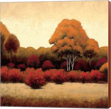 If you are looking for autumn art that has the warm colors of foliage front and center, pastel artist Lynn Krause’s work may be a good choice for you. She has an entire tree series that collectively shines a spotlight on the way that leaves change their colors. Some of her artwork, like Autumn Stream and Bright Autumn Day II, feature vivid yellows and oranges that are likely to really brighten up a place. Thus, you may want to put them in a bedroom or hallway with access to the outside.
James Wiens’ Autumn Art
Do you prefer the look of oil on wood or canvas instead of pastel and paper? Well then, work by contemporary artist, James Wiens may be more to your liking. He has two series of note, Autumn Trees and Autumn Forest. Both focus on fall foliage. However, the colors used in the paintings are much more subdued than those found in other artists’ work. Therefore, it would be feasible to hang them in rooms filled with early American furnishings.
To learn more about these artists’ work and find the ideal autumn art for your personal space, please visit Fulcrum Gallery.
Tags: Matthew Sievers art, Lynn Krause art, James Wiens art, Mathew Sievers art on canvas, framed Matthew Sievers art, Lynn Krause art on canvas, framed Lynn Krause art, James Wiens art on canvas, framed James Wiens art, autumn art, autumn framed art, autumn canvas art, season art, tree art, orange art, red art, yellow art, gold art, living room art, office art, Art Gallery, Art Gifts, art on canvas, art print, bright colors, canvas art, canvas gifts, canvas transfers, colorful art, contemporary art, contemporary decor, Contemporary Tress, framed gifts, Fulcrum Gallery, greens, Hanging Art, landscape art, landscapes, modern art, modern decor, nature art, Wall Decor, autumn gifts
by Fulcrum Gallery Staff
6. August 2014 10:34

At its inception, the pop art movement brought relief to those that had grown tired of works created by abstract expressionists. From there, it went on to become one of the most popular art forms of the rebellious 50's and free-wheeling 60's. Today, designers’ passion for decorating with pop art featuring Andy Warhol helps to keep the love affair going.
Warhol, for those readers that may have not been around during the early pop art movement, was born in the 1920's and died in the winter of 1987. His work was renowned the world over. The colorful, iconic images that he used helped to convey what was going on in pop culture, whether the activity was ultimately controversial or not. As such, his artwork often stirred strong feelings in fans and critics alike.
When decorating with pop art featuring Andy Warhol prints, there are several schools of thought to consider. For instance, some interior designers like to display Warhol’s art in areas that match the picture’s subject matter. Others prefer to put the artwork in unrelated, unexpected spots that help jolt viewers out of their rote activities. There are also those that focus more on the colors and patterns inherent in Warhol’s artwork than the actual subject matter.
 Take Andy Warhol’s Knives, c.1981-82 picture as an example. It could be hung up in a contemporary dining room or kitchen that has pops of black and cream coloring throughout. On the other hand, it could also be placed in a study or office with his series of Guns artwork and Skull, 1976 to show a love of mystery novels and forensic sciences.
There are other Andy Warhol prints on the market today that feature the artist’s quotes and images. One of our favorites is the one titled, Think Rich, Look Poor. It would look great on display in a bedroom changing area or walk-in closet. As would prints like It Takes a lot of Work to Figure Out How to Look So Good, Diamond Dust Shoes and Two Female Fashion Figures c. 1960.
To learn more about decorating with pop art featuring Andy Warhol, please contact us today. We have many prints of the artist’s work in stock as well as several other pop art prints of note.
Tags: abstract art, andy warhol, Art Gallery, Art Gifts, bright colors, Cities, contemporary art, contemporary decor, fine art, floral art, flowers, framed flower art, framed art, framed gifts, Fulcrum Gallery, fun art, Gifts, girls art, modern art, modern decor, pop art, spring colors, spring art, unique art, Wall Decor, framed pop art, framed Andy Warhol art, birthday, artists birthday, Andy Warhol pop art, colorful art, dining room art, kitchen art, interior design
Abstract Art | Pop Art | Featured Artist
by Fulcrum Gallery Staff
8. May 2014 15:52
With nearly every breed of dog represented in some way, artist Stephen Fowler approaches pet art in a fun contemporary style. If you're a dog lover, you NEED a piece of this art for your home or office, here are five reasons why:

- Man's Best Friend - Pets bring many people a sense of responsibility, happiness, and connection to life. When we see pictures of dogs that remind us of our own beloved animal(s), those same feelings arise and bring a moment of meaningful interaction to the day. Man's best friend needs a place on your wall, whether you currently have a dog, want to, or used to.
- Color - Stephen Fowler brings a fresh look to his dog art with delightful colors and dynamic text and patterns. The colors in his works will help set the mood in whatever room it is placed.
- Price - With prices starting at $9 and up for a print, these pieces of art are truly budget friendly.
- Size - Most of Stephen Fowler's dog art pieces are smaller in size (generally around 12"x12"), meaning you can surely find a nook or place to enjoy this work in your home or office.
- Conversation - The combined text and images on these artworks are sure to encourage some spontaneous conversation amongst your family and guests. Take pleasure in the discussions likely surrounding themes of pets past and present.
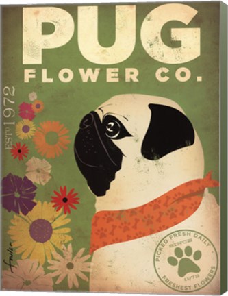
Fulcrum Gallery offers an assortment of Stephen Fowler art prints and many other great styles from similar artists too! Take a look at what our offerings can bring to your decorating style.
Tags: dog art, pet art, animal art, humor art, advertisments, Art Gifts, Art Gallery, art on canvas, canvas art, home decorating, home decor
by Fulcrum Gallery Staff
13. January 2012 11:02
FulcrumGallery.com
Circa 10/10/2002
FulcrumGallery.com is the inevitable outcome of a seemingly coincidental series of events which started in its founders, years before we ever met and started a business. Over time, a friendship, an interest in art and decorating, and a strong software development background led to the FulcrumGallery.com that exists today. As the old saying goes, "do what you love, and the money will follow."
Even so, we didn't actually plan to get into this business. As I like to say, it was more of an accident. We didn't sit down and look at the market landscape, deliberate over entry barriers, or consider strengths and weaknesses. In fact, we didn't even intend to be involved in e-commerce in any form at all. FulcrumGallery.com actually started off as a demo website for the software company we founded, Metaverse Corporation. Its purpose was to be an example of how easily a Web site could be updated using Metaverse's Content Management software. While many Content Management companies create a fictitious company for their demonstration Web site, we felt from the beginning that if we were to spend time creating a demonstration Web site, it should have some value on its own. Since we had a deep interest in art, we decided to build an art gallery.

On its launch date, October 10, 2002, the FulcrumGallery.com featured view-only artwork from famous artists. Salvador Dali, one of our personal favorites, was the first featured artist on the site. Since it was so easy to add artwork to the site, we quickly added a page letting visiting artists know they could submit their own artwork for display on the site. First slowly, then more and more frequently, artists started submitting their work. After hearing from several of our artists that they had received referrals from our site resulting in sales of their work, and hearing from art appreciators that they liked the artwork on our site, but were disappointed that there was no way to purchase the work, we decided to make the investment to turn FulcrumGallery.com into an online store and relaunched the site on September 26, 2003.
Initually we had only a couple hundred pieces of art for sale, all original art (mostly oil paintings). It wasn't until early 2004 that we expanded our product offering to a few thousand open edition fine-art prints. In October of 2004, we added our online Frame Shop, enabling customers to preview artwork with various high quality moldings and mats online. Today we offer a selection of over 200,000 works of art, encompassing nearly every imaginable subject matter, and offer a range of value added services such as custom framing and canvas transfers. We ship to thousands of customers each month, worldwide. We are a privately owned company operating in South Brunswick, New Jersey. FulcrumGallery.com exists because of the continued investment of its founders and employees. It is very much a work of blood, sweat, and tears. We take great pride in what we've created. If there's anything we can do to make your experience with us more enjoyable, please let us know.