by Fulcrum Gallery Staff
3. March 2016 09:00

Green art is an excellent way to bring life into your home, and what better time to do so than one of the liveliest days of the year, St. Patrick’s Day? The color green differs in quality and mood depending on shade, creating an array of decoration possibilities that is practically infinite. Maybe you’re a St. Patrick’s Day fanatic or into the peaceful vibe nature brings, or maybe you just love the color. Whatever your motivation, adding green to your home décor adds a fresh note to even the drabbest of walls. It is a choice you won’t regret.

Quite a versatile color, green can evoke life in medium to dark shades or convey a more whimsical quality in brighter hues, such as lime. St. Patrick’s Day embraces green’s entire spectrum, with art offerings including a variety of colors that can all be considered called green. You’re not just limited to art, however—something as simple as adding a plant or two can do wonders on its own. Life speaks to life, and plants will surely bring the energy level in a room way up. If trying to engage family members in a lively discussion, place plants in your dining or living room. Each is a setting designed to put people at ease and socialize.
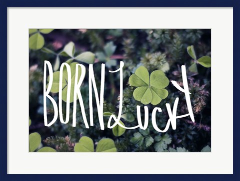 Born Lucky Leah Flores
What happens if you are a notorious plant neglector? Don’t let go of the lively family discussion ideal just yet—many things resemble or remind people of plants and don’t need to be watered twice a week. Check out plant-inspired artwork. For Saint Patrick’s day, this is easy—just sample any one of the many prints with four-leaf clovers and rainbows. Or, if you want a lot more green and a lot less rainbow, check out simpler art pieces that focus on that single color spectrum. Search for prints that convey only four-leaf clovers or prints with four-leaf clovers and other green items in the background (they exist—you don’t need to look hard to find them).

If you’re more career-oriented than family oriented, green is still a wonderful choice for you. Plants can make your study a more productive area, inspiring you to push through that last bit of work you’re sure you don’t have the energy to complete. If you dream of pots of gold, look for festive St. Patrick’s Day prints that incorporate them. Toss some good luck into your equation, too, with a bonus four-leaf clover or two. Some prints out there are stuffed with as many St. Patrick’s Day items as possible, so you shouldn’t have any trouble finding a print with your preferred combination.
No matter what kind of a person you are, you’re likely to respond well to your greener environment. This is because green has so many qualities that work in different ways. Research has proven that green has an array of positive effects. Bring green into your home and note the effects on your mood.
Tags: green, green art, green colored art, framed, framed art, framed green art, art, prints, artwork, posters, fine art, canvas, canvas art, art on canvas, art framed, kitchen art, bedroom art, colored art, color scheme art, decor ideas, decorating
Featured Color Art | Holiday Art | Photography | Word Art
by Fulcrum Gallery Staff
18. February 2016 15:03

We already said hello to 2016, but not many people have ushered in the colors of the year, serenity blue and rose quartz. In a world of political turmoil and everyday stress, these pastel colors can calm us down and speak peace into our lives. Now is the best time to incorporate the colors of the year into your home décor. Moreover, this is an ideal year for colors because there is not just one but two colors of the year for 2016!
Tranquility And Warmth
Rose quartz and serenity blue were chosen as 2016’s colors of the year for the feelings of tranquility and warmth that they evoke. We can all use a little more peace in our lives, so serenity blue is a timely color for the year. If the winter blues are getting to you, a touch of rose quartz will cheer you right up. Add these colors to your home décor for a greater sense of order and calmness. If you are looking forward to spring, or if you are looking for a piece of art that majors on the colors of the year, check out Sung Kim’s “Covered Bridge in Spring.” Blossoming trees highlight shades of rose in the distant Blue Mountains, and a silver-blue river flows peacefully under a covered wooden bridge.

A Duo For Relaxation
It is a bit unusual for there to be two colors of the year, but when you look at rose quartz and serenity blue together you will understand why they were chosen as a duo. These two colors complement each other perfectly, and together they accomplish more than they could alone. This is illustrated in Klaus Strubel’s “Paradise Dawn,” a glorious painting of a beachside sunrise. Swirls of rose quartz and serenity blue invite you to relax in the Adirondack chairs at the water’s edge and soak in the beauty of nature.
Accent With Frames
Since the colors of the year are so light, it is best to accentuate them with a frame. A gold frame will draw attention to the artwork and can be added to either of the pictures mentioned above as well as most of the artwork available from Fulcrum Gallery. You may also consider a black frame for a sleek finishing touch.

Color Pairings
What other shades can be paired with the colors of the year? Serenity blue stands out against dark blue and black; it can also be used with white or dark grey. For a different flavor, rose quartz can be matched with various shades of pink and red. Both serenity blue and rose quartz can be used with other pastel shades, such as green and yellow. Of course, the color combinations you choose will affect the mood of your environment. For example, a room done in pale yellow with the colors of the year will have a light and cheery air, while a room with white and pastel blue will seem nautical, and a room that adds the colors of the year to black or navy blue will feel serious and professional. Any of these combinations is magnificent; the choice is up to you and what atmosphere you want to create. Have fun and be creative with serenity blue and rose quartz this year!
Tags: colors art, colors, color, color of the year, 2016 colors, colors of the year, framed color art, canvas color art, art on canvas, art framed, framed art, prints, art, posters, fine art, art print
Featured Color Art | Framed Art
by Fulcrum Gallery Staff
14. September 2015 11:22
Sepia tones weren’t always looked at as part of up-to-the-minute, design schemes. They started out as a necessity. People harvested cuttlefish from the sea and used some of them to make ink. Over the years, the ink was used to create many different things. As such, it eventually found its way into the hands of photographers. They added it to their work in the hopes of increasing visual interest and longevity. Their efforts paid off and sepia toned pictures became very popular. Today, people are still using them to decorate their homes and offices. Although there are no framing or matting rules, most people choose to keep the overall look down-to-earth. Thus, sepia photography is often paired with frames and matting that matches or compliments the images’ natural tones. Also, people no longer feel the need to restrict their displays to images of the past.
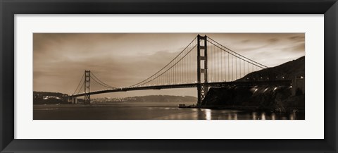
Golden Gate Bridge II
Consequently, sepia tones are creeping into contemporary artists’ photos too. For example, it is common to find them in collections of wildlife photography by artists like Susann Parker, Barry Hart, Monte Nagler, Tony Stromberg and Wendy Caro. It is also seen in bodies of work that focus on flowers, trees, architecture, waterscapes, transportation, business and more. So modern minded decorators have no shortage of geometric shapes, tones, textures and themes to work with when it comes to sepia photography. Of course the tones are still used to recreate the feel of bygone days as well. The list of fine examples includes Al Capone’s Wanted Poster, Tennis on the Wings, Vintage Football, Rosie O’Grady Firetruck and Jim Christensen’s Train Series. Each would certainly have a place in homes or businesses with a penchant for nostalgia. For instance, the Tennis on the Wings photo might look good next to model planes, antique altimeters or vintage rackets.
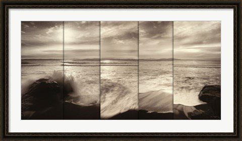
Tides and Waves
Tags: sepia, sepia art, sepia photography, art, fine art, art print, art prints, photo, photos, photography, picture, pictures, poster, posters, featured color, color, colors, featured colors
Featured Color Art | Framed Art | Photography
by Fulcrum Gallery Staff
15. May 2015 10:52

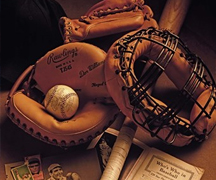
So you're a sports fanatic seeking to decorate your home or office with conversation pieces or maybe you just want a vintage sports theme for a specific room like your man cave or bedroom. Purchasing antiques can get expensive and require space to display them. Consider filling your space with vintage sports photography. Artwork is something that can hang on your walls so it doesn't take up too much space. It’s also a great way to surround yourself with conversation starters without going broke. There are a few tricks and things to consider when choosing vintage sports posters.
Choose a color!
One big thing to consider is the color. What will fit best in your decor, black and white, sepia toned or color sports photos. The color theme you choose can depend on the color of your walls, furniture and other accessories in the room. If the room is full of color it may be a good idea to use black and white or sepia to tone the colors down. Using color sports photography in a room full of color can become overwhelming. The sepia tones and photographs that lack rich colors is what tends to give the photograph a more vintage feel. When you find the right color for your room, the finish for the print is your next big step. If a frame compliments your piece best, you'll want to use a frame that has more of a vintage feel rather than a modern frame. Some mat colors that may pair well with retro sports photos include egg shell, buff and serene cream.

The Sport or the Name?
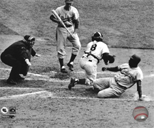
Before you automatically select photography that includes famous athletes or stadiums, browse pictures that feature the unexpected or show humankind’s love of the sport. Good examples are photos like Free Golf and Retrieving the Ball. Each one presents everyday people engaged in the sport of golf. We carry prints in various types of categories like football, racing cars, hockey, tennis, lacrosse and more. So take time to find the beautiful golf course or the motivational soccer poster rather than automatically searching for famous sports players and stadiums.
If you do feel compelled to spotlight famous athletes or locations, there are tons of sports places and people to choose from in our categories. One of our best illustrations in that regard may be found in the photo titled, Lou Gehrig – With Bats. It's almost a 3-D look the way that the baseball bats are positioned, it gives the illusion that they are literally coming out of frame. This piece and pieces like it would look great printed on a seamless piece of canvas or a two-toned, ebony and gold bastion frame.

The Last Game
The last best thing to consider is the last game. If you have a favorite athlete, finding photographs from their last game is not only great decor but a great conversation starter as well. A good example would be to pair photos like Lou Gehrig – Farewell #2 or Babe Ruth - Farewell.
Finish it Off
Artwork is not complete with out a frame, laminate or canvas finish. If a canvas best suites your desired piece, choose a painted sides color that matches something in the frame. For black and white photos, black painted sides is always an amazing finish. If you're choosing a frame finish, choose a vintage styled frame. You can also choose a frame that matches the furniture in the room it will decorate. If you have a mahogany colored bed frame and the chosen piece is going in that bedroom, try choosing one of our mahogany frames if they match the piece as well.
All of our frame and canvas finishes come with 100% Satisfaction Guaranteed.
Tags: vintage art, sports art, vintage sports art, vintage sports photography, vintage sports posters, vintage sports prints, vintage sports paintings, sports prints, retro art, sports art on canvas, framed sports art, vintage art on canvas, framed vintage art, basketball art, baseball posters, black and white art, black art, black frame art, Black & White photography, black & white art, black & white, canvas print, canvas gifts, children's art, collage art, framed, frame options, frame, framed art, framed artwork, framed art prints, framed art on canvas, framed canvas, framed cultural art, framed educational art, framed gifts, gifts for dad, gifts for Mom, Gifts, game room art, photography, photograph, photography on canvas, photos, photos on canvas, picture, pictures, vintage photography, vintage photography on canvas, vintage posters, vintage prints
Black & White | Canvas Art | Featured Color Art | Framed Art | Photography | Retro Art | Vintage Art | Word Art
by Fulcrum Gallery Staff
8. January 2015 13:11
Black & white photography is timeless. It adds depth to its surroundings and can bring an instant element of class and elegance to a room. However some people shy away from the idea of using black and white photos for decorating, afraid it will look dull and lack creativity. This could not be more untrue. Black and white is the perfect medium for decorating with pictures in any room in the house; even a child’s bedroom. The key is in knowing how to use it.
Tips for decorating with black and white photography:
Tip 1: Black and white photos are ideal for decorating brightly colored walls because they won’t conflict with the surrounding color. Use the same frame style and color for every picture to prevent competition, while drawing one’s eye to the subject of the photo. Solid black or white frames with white matting work well with vivid backgrounds.
Tip 2: Adorn a child’s room with black and white prints of a subject they love. Baseball fans will be thrilled by the variety of vintage shots featuring famous sluggers and well-known stadiums. For a child who adores animals, black and white pictures of puppies, kittens or horses play well against pale blue or pink walls.
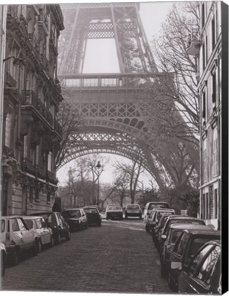
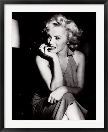
Tip 3: Teenage girls enjoy themed decor such as Paris, glamorous movie stars or dance. Paired in brightly colored or black frames against white or cream walls, black and white photos will blend in beautifully with her inspiration.
Tip 4: Neutral colored walls in a living space form the perfect pallet for black and white art. Photos of the beach or ocean framed in distressed white, light blue or natural wood give a special touch to a coastal themed room. A more modern and chic look can be achieved by combining photos in both black and white frames in a beige room with white trim and shelves and black wrought iron wall hangings, candle holders and lamps.
Black and white photos can be dramatic, playful, elegant or glamorous, bringing tremendous beauty and infinite possibilities for decorating to a home. Consider the possibilities in your own home and then browse our large selection of black and white photography.
Tags: black and white art, black & white art, art by color, art for kids, Art Gallery, Art Gifts, art on canvas, art print, art prints, black art, black frame art, business decor, canvas art, canvas transfers, children's art, custom canvas, custom framing, custom framed canvas, custom gifts, fine art, featured artwork, framed, framed art, framed black and white gifts, framed photography, framed vintage photography, framed vintage art, framed vintage posters, Fulcrum Gallery, Gifts
Black & White | Canvas Art | Featured Color Art | Photography | Vintage Art
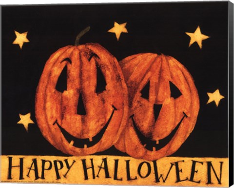
by Fulcrum Gallery Staff
23. October 2014 13:57
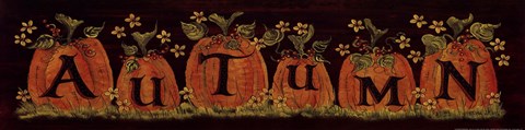
Halloween is a wonderful time of year to embrace your truly spooky side. It is a time when you can go all out with scary home decor or you can take a more tasteful and intriguing route. The possibilities are endless! Let's take a few minutes to go over a few of the different color schemes you can use while decorating for Halloween.
A Halloween Color
ORANGE DECOR
You can choose to decorate with all orange and orange art. You can use a large roll of craft paper in orange and put a giant Jack-O-Lantern on your front door along with orange window treatments with crepe paper or even orange string lights on your bushes. Orange is a great accent color and let's not forget, pumpkins are orange and Jack-O-Lantern's are a fun family project!
BLACK DECOR
Another option is to use black decorations or black art. This may sound a bit depressing but when you look over the options of black art it's quite mystical and enjoyably spooky! You can put a black, skeletal tree in front of your house or on a door and use black cut out's to represent ghosts or other ghouls!
Pumpkin Decor
A wonderfully traditional option is to decorate with pumpkin art. There are tons of wonderful artistic representations of pumpkins to use and the best part, you can keep a lot of them up through Thanksgiving!
Traditional Halloween Art
 Finally, a great way to decorate that is simple and festive, is to use Halloween posters. It is not as invasive as other decor schemes but gives your Halloween visitor some fun art to peruse while they visit.
A great way to decorate with Halloween art that is both fun, scary and hopefully intriguing is to do some kind of mix of the above suggestions, you can decorate with orange and black art while also adding in pumpkin and Halloween art to create a really lush and fun home this Halloween season. Don't be afraid to embrace your spooky side with these options and make sure to check out some of the other options we offer here at FulcrumGallery.com.
Tags: holiday art, Halloween art, black art, orange art, spooky art, scary art, fun art, Halloween prints, Halloween posters, Halloween paintings, Halloween Decor
Autumn | Featured Color Art | Holiday Art
by Fulcrum Gallery Staff
10. October 2014 08:20
Everyone loves popular color trends when they decide to remodel their home or renovate! It's fun to change your decor every once in a while to keep up with current popular color schemes. A very popular color for home decor, especially for this autumn season, is gold. Gold represents a meaning of success, achievement, and triumph. We often associate the color gold with money or wealth, but the color gold has so much more to tell us than just wealth. Many people have linked the color gold as a way to feel empowered and choose to think gold can give off a vibe of positive energy. Some also believe that gold can bring good wisdom, understanding, and enlightenment.
Represents a Meaning of Success, Achievement, and Triumph!
Often we see gold metals for the winner of a race so we connect the color gold and it's meaning to the winner's metal. This color draws attention to itself, it is eye-catching, passionate, and confident. Gold is a color that is often overlooked when choosing decor because of the flashy and wealthy vibe it shows. Decorating an office with gold art, or neutral colored prints with a gold frame, can give one a sense of empowerment and success. Getting gold art, art with a gold frame, or art on canvas with gold painted sides is not only suitable for your office. These will also raise your feeling of success in a library or study room.
Perfect Decor for Autumn Season!
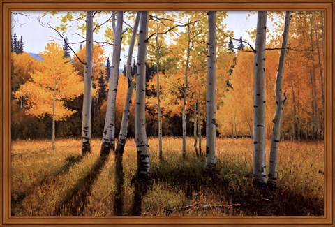
Not only is gold great decor for offices, classrooms, libraries, and study rooms, but it is also great for general home decor during autumn season! Decorating your home with paintings and photographs of golden autumn trees and the golden kissed sky during sunset is a great way to bring the beauty of autumn into your home with out having crunchy leaves. Gold autumn decor helps a room pop with color and come to life. Golden touched autumn art is especially a great decor choice for those who find themselves who favor autumn over other seasons. If autumn season is your favorite, why not leave the autumn decor up year round to keep your favorite season around!
Although gold is a popular color to decorate, you want to make sure to not overdo it. Having too much gold decor in your home can be overwhelming since gold is such a bold color. If the room is painted a solid color that compliments gold, just decorating with gold is perfectly fine! But remember, gold is a loud color that does not need help standing out and making a statement. Too much gold decor can ruin the statement you want to make. If done correctly, gold decor can be the perfect inspirational art, or the perfect seasonal art!
Tags: floral art, gold art, autumn art, success art, office art, library art, Art Gallery, Art Gifts, art on canvas, art print, art prints, autumn framed art, autumn gifts, black art, bright colors, business decor, canvas art, canvas gifts, canvas transfers, Color Photography, color trends, colorful art, Contemporary Art, contemporary decor, Contemporary Landscapes, Contemporary Tress, custom framing, custom canvas, decorating ideas, fine art, flower art on canvas, flowers, framed, framed gifts, Fulcrum Gallery, Gifts, home decor, home decorating, Inspirational Art, interior design, landscapes, season art, tree art, Wall Decor
Autumn | Featured Color Art