by Fulcrum Gallery Staff
18. February 2016 15:03

We already said hello to 2016, but not many people have ushered in the colors of the year, serenity blue and rose quartz. In a world of political turmoil and everyday stress, these pastel colors can calm us down and speak peace into our lives. Now is the best time to incorporate the colors of the year into your home décor. Moreover, this is an ideal year for colors because there is not just one but two colors of the year for 2016!
Tranquility And Warmth
Rose quartz and serenity blue were chosen as 2016’s colors of the year for the feelings of tranquility and warmth that they evoke. We can all use a little more peace in our lives, so serenity blue is a timely color for the year. If the winter blues are getting to you, a touch of rose quartz will cheer you right up. Add these colors to your home décor for a greater sense of order and calmness. If you are looking forward to spring, or if you are looking for a piece of art that majors on the colors of the year, check out Sung Kim’s “Covered Bridge in Spring.” Blossoming trees highlight shades of rose in the distant Blue Mountains, and a silver-blue river flows peacefully under a covered wooden bridge.

A Duo For Relaxation
It is a bit unusual for there to be two colors of the year, but when you look at rose quartz and serenity blue together you will understand why they were chosen as a duo. These two colors complement each other perfectly, and together they accomplish more than they could alone. This is illustrated in Klaus Strubel’s “Paradise Dawn,” a glorious painting of a beachside sunrise. Swirls of rose quartz and serenity blue invite you to relax in the Adirondack chairs at the water’s edge and soak in the beauty of nature.
Accent With Frames
Since the colors of the year are so light, it is best to accentuate them with a frame. A gold frame will draw attention to the artwork and can be added to either of the pictures mentioned above as well as most of the artwork available from Fulcrum Gallery. You may also consider a black frame for a sleek finishing touch.

Color Pairings
What other shades can be paired with the colors of the year? Serenity blue stands out against dark blue and black; it can also be used with white or dark grey. For a different flavor, rose quartz can be matched with various shades of pink and red. Both serenity blue and rose quartz can be used with other pastel shades, such as green and yellow. Of course, the color combinations you choose will affect the mood of your environment. For example, a room done in pale yellow with the colors of the year will have a light and cheery air, while a room with white and pastel blue will seem nautical, and a room that adds the colors of the year to black or navy blue will feel serious and professional. Any of these combinations is magnificent; the choice is up to you and what atmosphere you want to create. Have fun and be creative with serenity blue and rose quartz this year!
Tags: colors art, colors, color, color of the year, 2016 colors, colors of the year, framed color art, canvas color art, art on canvas, art framed, framed art, prints, art, posters, fine art, art print
Featured Color Art | Framed Art
by Fulcrum Gallery Staff
14. September 2015 11:22
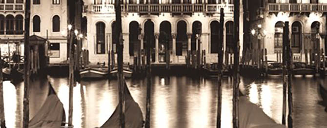
Sepia tones weren’t always looked at as part of up-to-the-minute, design schemes. They started out as a necessity. People harvested cuttlefish from the sea and used some of them to make ink. Over the years, the ink was used to create many different things. As such, it eventually found its way into the hands of photographers. They added it to their work in the hopes of increasing visual interest and longevity. Their efforts paid off and sepia toned pictures became very popular. Today, people are still using them to decorate their homes and offices. Although there are no framing or matting rules, most people choose to keep the overall look down-to-earth. Thus, sepia photography is often paired with frames and matting that matches or compliments the images’ natural tones. Also, people no longer feel the need to restrict their displays to images of the past.
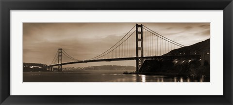
Golden Gate Bridge II
Consequently, sepia tones are creeping into contemporary artists’ photos too. For example, it is common to find them in collections of wildlife photography by artists like Susann Parker, Barry Hart, Monte Nagler, Tony Stromberg and Wendy Caro. It is also seen in bodies of work that focus on flowers, trees, architecture, waterscapes, transportation, business and more. So modern minded decorators have no shortage of geometric shapes, tones, textures and themes to work with when it comes to sepia photography. Of course the tones are still used to recreate the feel of bygone days as well. The list of fine examples includes Al Capone’s Wanted Poster, Tennis on the Wings, Vintage Football, Rosie O’Grady Firetruck and Jim Christensen’s Train Series. Each would certainly have a place in homes or businesses with a penchant for nostalgia. For instance, the Tennis on the Wings photo might look good next to model planes, antique altimeters or vintage rackets.
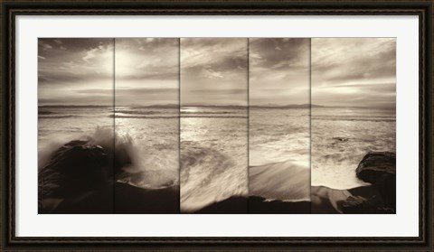
Tides and Waves
Tags: sepia, sepia art, sepia photography, art, fine art, art print, art prints, photo, photos, photography, picture, pictures, poster, posters, featured color, color, colors, featured colors
Featured Color Art | Framed Art | Photography