by Fulcrum Gallery Staff
8. January 2015 13:11
Black & white photography is timeless. It adds depth to its surroundings and can bring an instant element of class and elegance to a room. However some people shy away from the idea of using black and white photos for decorating, afraid it will look dull and lack creativity. This could not be more untrue. Black and white is the perfect medium for decorating with pictures in any room in the house; even a child’s bedroom. The key is in knowing how to use it.
Tips for decorating with black and white photography:
Tip 1: Black and white photos are ideal for decorating brightly colored walls because they won’t conflict with the surrounding color. Use the same frame style and color for every picture to prevent competition, while drawing one’s eye to the subject of the photo. Solid black or white frames with white matting work well with vivid backgrounds.
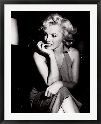
Tip 2: Adorn a child’s room with black and white prints of a subject they love. Baseball fans will be thrilled by the variety of vintage shots featuring famous sluggers and well-known stadiums. For a child who adores animals, black and white pictures of puppies, kittens or horses play well against pale blue or pink walls.
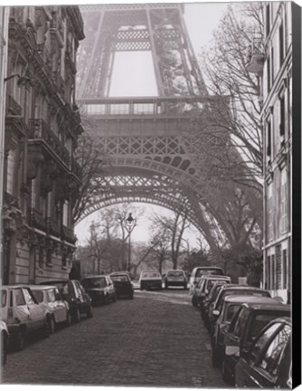
Tip 3: Teenage girls enjoy themed decor such as Paris, glamorous movie stars or dance. Paired in brightly colored or black frames against white or cream walls, black and white photos will blend in beautifully with her inspiration.
Tip 4: Neutral colored walls in a living space form the perfect pallet for black and white art. Photos of the beach or ocean framed in distressed white, light blue or natural wood give a special touch to a coastal themed room. A more modern and chic look can be achieved by combining photos in both black and white frames in a beige room with white trim and shelves and black wrought iron wall hangings, candle holders and lamps.
Black and white photos can be dramatic, playful, elegant or glamorous, bringing tremendous beauty and infinite possibilities for decorating to a home. Consider the possibilities in your own home and then browse our large selection of black and white photography.
Tags: black and white art, black & white art, art by color, art for kids, Art Gallery, Art Gifts, art on canvas, art print, art prints, black art, black frame art, business decor, canvas art, canvas transfers, children's art, custom canvas, custom framing, custom framed canvas, custom gifts, fine art, featured artwork, framed, framed art, framed black and white gifts, framed photography, framed vintage photography, framed vintage art, framed vintage posters, Fulcrum Gallery, Gifts
Black & White | Canvas Art | Featured Color Art | Photography | Vintage Art
by Fulcrum Gallery Staff
28. November 2014 08:58
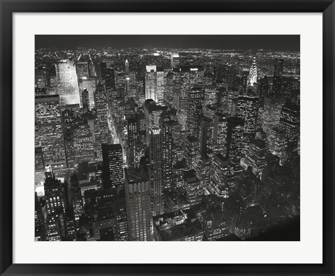
Christopher Bliss's photography is a great addition to any decor style. Growing up in the beautiful city of New York, Bliss's work reflects the architecture and skylines he grew up with. His work is mostly in black and white making the contrast able to work with most decor. The architecture and contrast of the photographs are striking and subtle allowing them to work in any environment. Architecture photographs are able to play off the light in any room, naturally or artificial lit.
You have your choice of scenery in color or black and white and of architecture or nature, and even your choice of city. From a bedroom sanctuary to the busy kitchen, his work can fit right in. If you adore the city or nature, he has art to suit your home. Christopher Bliss finds inspiration in the invigorating city, and you can too with his photographs.
Originally trained as a concert pianist at the Vienna Academy of Music, the Manhattan School of Music, and the University of Southern California, and now turned photographer, Christopher Bliss's art is truly beautiful. Christopher Bliss Photography reflects this as the photographs are as detailed as a piece of beautiful music.
His photography is held in high esteem and he is often sought after. His work can be found in several galleries and even in two separate photography books, one of which is on the beautiful New York City. Some of his work is even in the permanent collection of the Museum of the City of New York.
Tags: photography, framed photography, art for dad, Art Gallery, Art Gifts, art print, art prints, black and white art, black art, bridges, business decor, Cities, cityscapes, fine art, Fulcrum Gallery, Gifts, photos, Christopher Bliss art, Christopher Bliss photography, framed Chris Bliss art
Black & White | Featured Artist | Photography
by Fulcrum Gallery Staff
17. October 2014 08:39
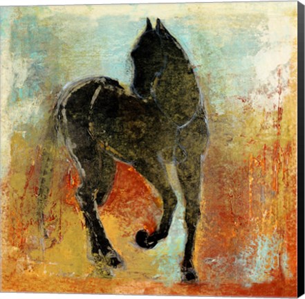
If you are a fan of abstract paintings, there is a good chance that you’ve at least heard of artist Maeve Harris. For those that have not heard of her, please allow us to make the introduction. She is a versatile, Seattle-based phenomenon that’s known for her intuitive use of organic forms and blending techniques. In addition, she tends to incorporate elements of photos, literature and history into her work. Here’s a look at several excellent examples of her innate talent:
Maeve Harris Collection: Moment Series
Maeve Harris’ Moment Series is a prime example of her brilliant use of brush strokes to create the illusion of movement. The paintings in the series are appropriately titled Moment I and Moment II. In both instances, she blends blacks, whites, yellows and browns to create two distinct, abstract focal points. Because of their abstract nature and coloring, the paintings could very easily be used in a variety of settings.
Maeve Harris Collection: Jetty & Crème Series
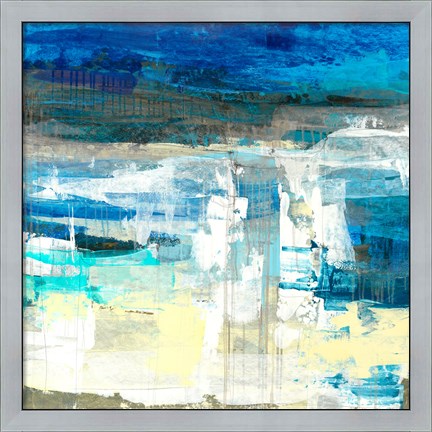
Understandably, Maeve Harris does not restrict her color palette to the ones found in the Moment Series. She has two series that would be ideal for use in beach homes or areas ripe with cool tones. Those two series are Jetty and Crème. Each abstract painting in the two series incorporates white and off white colors. The Jetty Series, however, also infuses those colors with shades of blue and green. As such, all four paintings would look wonderful paired with natural items like pressed seaweed, sand sculptures, bowls of beach glass and driftwood fragments.
Maeve Harris Collection: Floral Paintings
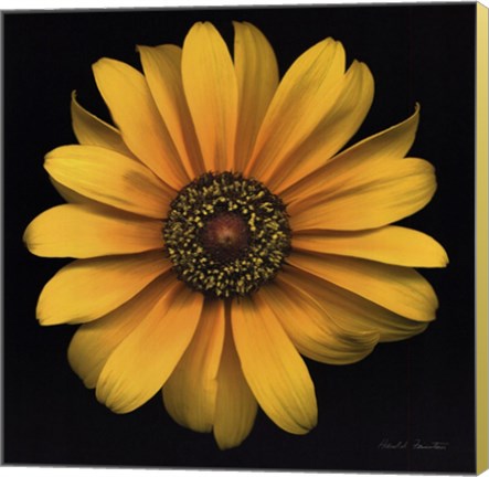
No discussion of artist Maeve Harris’ work would be complete without a mention of her floral paintings. She has several collections that focus on flowers. Among the flowers highlighted in the various collections are marguerites, orchids, chiaroscuros and roses. Colors used in Harris’ floral paintings vary greatly. Therefore, it is easy to find one that will fit in with most design schemes.
Would you like to learn more about artist Maeve Harris and her exceptional paintings? If so, stop by the Fulcrum Gallery today.
Tags: Maeve Harris Art, Maeve Harris framed art, Maeve Harris art on canvas, canvas art, collections art, framed art, framed collections, abstract art, horse art, featured artist, animal canvas art, framed blue art, blue abstract artanimal gifts, Art Gallery, Art Gifts, bathroom decor, business decor, canvas abstract art, canvas gifts, canvas transfers, color trends, colorful art, contemporary art, contemporary decor, custom canvas, custom framed canvas, custom framing, custom gifts, customized gifts, decorating ideas, fine art, framed
Abstract Art | Animal Art | Featured Artist
by Fulcrum Gallery Staff
10. October 2014 08:20
Everyone loves popular color trends when they decide to remodel their home or renovate! It's fun to change your decor every once in a while to keep up with current popular color schemes. A very popular color for home decor, especially for this autumn season, is gold. Gold represents a meaning of success, achievement, and triumph. We often associate the color gold with money or wealth, but the color gold has so much more to tell us than just wealth. Many people have linked the color gold as a way to feel empowered and choose to think gold can give off a vibe of positive energy. Some also believe that gold can bring good wisdom, understanding, and enlightenment.
Represents a Meaning of Success, Achievement, and Triumph!
Often we see gold metals for the winner of a race so we connect the color gold and it's meaning to the winner's metal. This color draws attention to itself, it is eye-catching, passionate, and confident. Gold is a color that is often overlooked when choosing decor because of the flashy and wealthy vibe it shows. Decorating an office with gold art, or neutral colored prints with a gold frame, can give one a sense of empowerment and success. Getting gold art, art with a gold frame, or art on canvas with gold painted sides is not only suitable for your office. These will also raise your feeling of success in a library or study room.
Perfect Decor for Autumn Season!
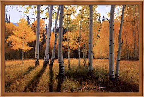
Not only is gold great decor for offices, classrooms, libraries, and study rooms, but it is also great for general home decor during autumn season! Decorating your home with paintings and photographs of golden autumn trees and the golden kissed sky during sunset is a great way to bring the beauty of autumn into your home with out having crunchy leaves. Gold autumn decor helps a room pop with color and come to life. Golden touched autumn art is especially a great decor choice for those who find themselves who favor autumn over other seasons. If autumn season is your favorite, why not leave the autumn decor up year round to keep your favorite season around!
Although gold is a popular color to decorate, you want to make sure to not overdo it. Having too much gold decor in your home can be overwhelming since gold is such a bold color. If the room is painted a solid color that compliments gold, just decorating with gold is perfectly fine! But remember, gold is a loud color that does not need help standing out and making a statement. Too much gold decor can ruin the statement you want to make. If done correctly, gold decor can be the perfect inspirational art, or the perfect seasonal art!
Tags: floral art, gold art, autumn art, success art, office art, library art, Art Gallery, Art Gifts, art on canvas, art print, art prints, autumn framed art, autumn gifts, black art, bright colors, business decor, canvas art, canvas gifts, canvas transfers, Color Photography, color trends, colorful art, Contemporary Art, contemporary decor, Contemporary Landscapes, Contemporary Tress, custom framing, custom canvas, decorating ideas, fine art, flower art on canvas, flowers, framed, framed gifts, Fulcrum Gallery, Gifts, home decor, home decorating, Inspirational Art, interior design, landscapes, season art, tree art, Wall Decor
Autumn | Featured Color Art
by Fulcrum Gallery Staff
3. July 2014 13:59

Framed mirrors can really make a home appear to expand in size and reflect incoming light to make rooms feel airy and full of light. They can also be a great alternative to hanging artwork. Wherever you want to add wall decor but don't feel you have the right piece of art or other decor to place there, consider a mirror as a solution.
Here are some key tips for decorating with mirrors instead of artwork:
Finding the Right Frame: You want to frame your mirror to highlight it but not to overwhelm it. You don't want a small mirror to have a big, bulky frame and you probably don't want a large mirror to have a thin, delicate looking frame. The frame should accent the mirror, making it a highlight of your room when used as an alternative to artwork on the wall.

Location and Size: One of the first steps in choosing the right framed mirror is to decide exactly where you plan to hang it and look at size considerations. Is the mirror meant to hang above a fireplace? Do you want it to reflect a pleasing outdoor view from a window? Do you want to reflect the light fixture on the ceiling to double the apparent light? Look at the space and measure how large the mirror should be for that location. If you are placing the mirror above a sofa, you don't want the mirror to overwhelm the seating, so choose a size about 1/2 to 2/3 the length of the sofa. The same is true if you are choosing a framed mirror for hanging over the fireplace mantel.
Color Scheme: In most cases, you will want the mirror frame to stand out against the wall treatment. If you have light colored walls, your options are endless. If you have a wall treatment with a significant pattern or texture, you might consider a wooden frame that contrasts strongly with the wall colors. You can have metallic accents on your mirror frame is you like no matter what color or type of wood you choose, creating an endless combination of designs to satisfy any setting.

Style: Choose a framed mirror that blends with the overall style of the room. If you have a formal living room, you want a very formal look for your framed mirror but if you have ultramodern or rustic country, you can find a frame that suits that style just as well. Whatever your furnishings and decor you can have a framed mirror that blends well with that style.
Shop our selection of framed mirrors today and get 50% off! To get the right framed mirror to meet your requirements for accenting a room as an art alternative or as a functional mirror, contact us and we can provide you with exactly the custom framed mirror for your needs.