Accenting With Art Work by Loran Speck

by Fulcrum Gallery Staff 5. November 2015 16:51

“Italian Feast” by Loran Speck is a beautiful and exquisite piece. With his various works of art, Speck would rather the painting explain itself than with an actual written out explanation. He creates highly detailed pieces and has been often compared to great Dutch masters because of his astonishing use of color and light. 

Make a bold statement


Bold Statement

To incorporate this painting into a Dining Room, Breakfast Room or even a Kitchen would be no challenge at all. With the paintings wide variety of rustic color, you could accent this piece with almost any colored picture frame. You could use a dark red picture frame to bring out the tablecloth and red wine or you could use a dark brown to contrast with all of the tans, beiges and creams that are found throughout the picture. If you have a bright or upbeat color for the walls, the painting might not work as well in the room. You would need a calmer, more neutral color for this piece to make a statement on its own and to match the other décor. You want to make sure the colors are more subtle rather than overpowering. Whether kept for yourself or gifted to another, “Italian Feast” can be a beautiful centerpiece to a room.


Loran Speck	Italian Feast

Italian Feast by Loran Speck


Style

One thing Speck really wanted to achieve through his paintings was to give off a sense of who he was. With this being said, he loved simplicity and quiet intimacy. This is definitely a great interpretation of who he and how great he was at still life’s, shown with the painting “Italian Feast”. This is a simple, yet bold piece. It is not too busy with many different elements and it doesn’t get lost with too many different colors. This piece is a perfect balance between simple objects and portraying them in a beautiful way.


Obvious Popularity

Loran Speck intended for the piece “Italian Feast” to exude simplicity and for this same reason, it gained its popularity. He used a beautiful color scheme and wide variety of brush strokes to interpret his vision onto paper. There is no doubt that many people love this work of art for its simplicity as well as many other reasons. It is left up to the imagination to determine the purpose and intention this piece perceives. Someone doesn’t need to know the artist or the paintings background to fall in love with this work of art. Along with enjoying how it looks, people also enjoy the unspoken meaning behind the painting. With the endless possibilities of how to decorate with this piece, there is no question why it is a favorite among many.


Loran Speck	Confit Jar with Pears & Grapes

Loran Speck brings still lives to life because of how he uses many details for his work. “Italian Feast” is just one of many still lives that Speck has created and it is beautiful nonetheless. Although there are and have been many artists in the world, Loran Speck does a good job of setting himself apart from the others through his work.


Aesthetic Considerations: Is a Canvas Finish Always the Best Option for Art?

by Fulcrum Gallery Staff 2. December 2014 14:58

Is a canvas finish always the best option for art? No. When choosing the finish for art, there are a number of important aesthetic factors to consider, including colors, details, and style.

ISLAND BLOSSOM II

 Colors

Think about the texture of a canvas. It has fine grooves that seem to disappear at a certain distance, yet are very noticeable up-close. The distance point of this seemingly disappearance is largely related to the amount of colors in a given art work.

When art works have chunks of clearly defined colors, the texture of canvas stops leaving an impression on the eyes at a short distance. In other words, the bolder the colors, the less the canvas texture stands out. Even though some of the most amazing artworks in history were created on canvas, the recreations of these artworks often look much better when printed on high quality art paper.

Renaissance, neoclassical, and romanticism in particular have exorbitant amounts of gradient colors that blend into one another. These blended colors become muted and far less noticeable when the texture of canvas comes into play, which creates a blurred rather than a detailed image.

 Details

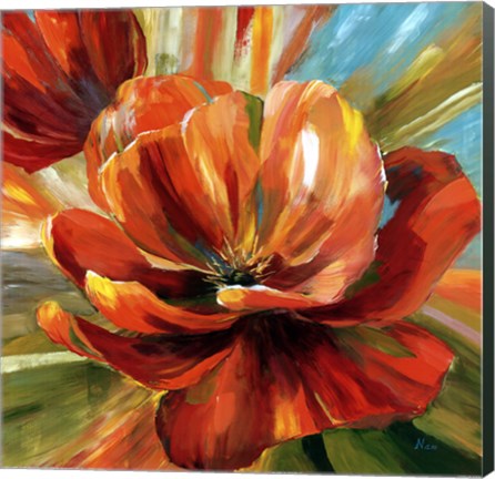
 Artworks with bold or simple colors and crisp details work best on canvas. Pop Art, vintage art, and photography are great examples of art that looks amazing on canvas. The bold colors and simple shapes of pop art are not lost in the texture of canvas. Similarly, the crisp details and colors of vintage art also look great on canvas, since the details are not at risk of being blurred or obscured by the texture of canvas.

First Cousins

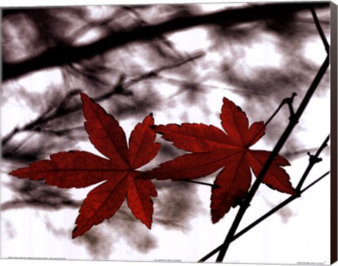
 Photography also looks great on canvas because the crisp, almost perfect, details of reality are captured through the lens. When photographs are then transferred to canvas, it creates the less than perfect perception of reality that actually occurs with human vision, instead of the view of the objective lens.

Style

The colors and details of art certainly relate to style of art, but there are many artworks that are less defined by genre or artistic movement and more defined by the individual style of the artist.

Word art, for example, may or may not look best on canvas, depending on the colors, as well as the style. Curvy font, subtle shifts in color, and scroll-work would not be well-suited for canvas, while block font, bold colors, and a clean background would be well-suited for canvas.


Keep these elements in mind when choosing the medium to showcase art, and feel free to contact us about any questions you may have!

FulcrumGallery

Visit our online store fulcrumgallery.com 

Homepage
FacebookPinterestTwitterGoogle PlusHouzz


We Encourage Stalking

Month List

Calendar

<<  April 2024  >>
MoTuWeThFrSaSu
25262728293031
1234567
891011121314
15161718192021
22232425262728
293012345

View posts in large calendar