by Fulcrum Gallery Staff
26. March 2015 16:23

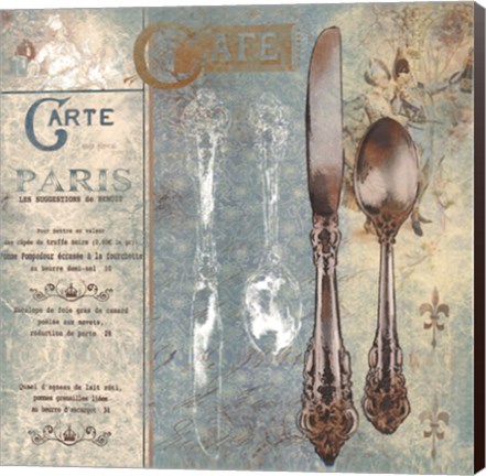
If former U.S. President Abraham Lincoln were still walking this earth, he’d be turning a whopping 206 years old this past February and we can’t imagine what that would be like for him. However, what we can imagine is how wonderful it would be to walk into a display area during this month’s Presidential holidays that’s filled with images from American history. The former 16th President’s image could be at the center of the display.
Over the years, there have been many paintings and photos taken in Abraham Lincoln’s memory. The list of artists whose work has spotlighted the former world leader at one time or another includes George Henry Story, Howard Pyle, Nathaniel Currier, Jason Lauritis and Mark Hampton. Some of the artists, like Howard Pyle, also created a great deal of art devoted to the Civil War and American history in general.
Others, like Jason Laurits, choose to take a quirky approach towards the former U.S. President. For example, he created a print featuring Lincoln wearing roller blades. It would pair well with contemporary pieces like Abraham Lincoln’s Face Against Colored Backgrounds, Abraham Lincoln: Honesty, Freedom, Equality, Tails and Heads. We should also mention that the artists who created the first two pieces are unknown. The third and fourth prints were created by artist David Bromstad. They are part of a two-piece series that showcases American currency.
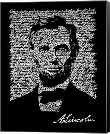
Politics aside, Lincoln was such an interesting figure in his own right. As such, his image could be paired with artwork associated with his personal life. For instance, it is well-known that he loved his pets and often let them eat at the dinner table with him. He was also very religious, enjoyed wrestling and even participated in a séance at one time in his life. So a display created in his honor could include pictures of cats, dogs, wrestlers and the reprint of a 1800s Poster Advertising a Psychic Performance by the Davenport Brothers.
To find the framed artwork mentioned above and other pieces of Americana that could be used to celebrate Presidential holidays, please contact us at the Fulcrum Gallery.
Tags: word art, word prints, word paintings, pop art, canvas art, canvas word art, word art on canvas, black and white art, white and black art, abstract art, speech art, LA Pop art, red art, yellow art, blue art, black art, white art, holiday art, birthday art, Lincoln art, president art
Abstract Art | Black & White | Canvas Art | Cultural Art | Holiday Art | Modern | Pop Art | Vintage Art | Word Art
by Fulcrum Gallery Staff
14. November 2014 12:46

"When I close my eyes and let the sounds take me away, my mind is flooded with creativity. I can almost visualize the sounds," says artist, Natalie Talocci.
Natalie Talocci is a local young artist who creates unique abstract art. She has been an artist almost all of her life. Talocci received her Bachelor's Degree of Fine Arts from William Patterson University. She has created many pieces that are full of color and life. Though most of her pieces are of animals on land and underwater, she also has painted many portraits, cultural paintings, and has created sculptures.
This November, Natalie Talocci begins her first solo art show at Gold Light Gallery 's opening on November 8th in New Hope, PA. A lot of Talocci's Pieces were displayed at Gold Light Gallery but her Jelly Fish Invasion series was featured. These pieces show the beauty and uniqueness of unique sea life creatures, Jellyfish. "There is something extraordinary about these gelatinous creatures that drift through water so weightless and free," Talocci says. And that is exactly how her art depicts them. When seeing these original pieces, it's almost like watching these animals in their natural habitat.
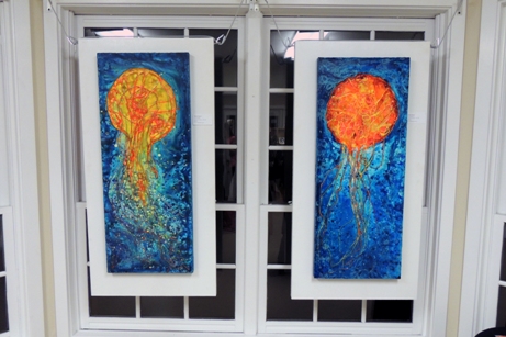
Natalie created her Jelly Fish Invasion series in a unique way. She started off with a quick sketch. Then she used hot glue to build borders, this gives the finished product texture and really helps it come to life.

Natalie gets her inspiration from music and other famous artists when creating these pieces. Some of her biggest inspirations are Alphonse Mucha, Keith Haring and Wassily Kandinsky. Talocci also stated that New Hope, PA offers a lot of inspiration. Just down the street from Gold Light Gallery, there is a bridge in which you often find artists sitting out with easels painting the beautiful, scenic view. Her advice to upcoming artists is to find a place like New Hope, PA that will give you inspiration.
Natalie is excited to have her Jelly Fish Invasion series featured at Gold Light Gallery. Her series will be featured throughout the month of November during which these original pieces will be available for purchase.
Tags: canvas art, original art, Natalie Talocci, Natalie Talocci art, jelly fish art, jelly fish canvas, gold light gallery art, gallery opening, featured artist, sea life art, abstract art, pop art, colorful art
Abstract Art | Animal Art | Featured Artist | Pop Art
by Fulcrum Gallery Staff
17. October 2014 08:39
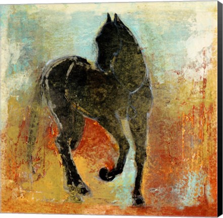
If you are a fan of abstract paintings, there is a good chance that you’ve at least heard of artist Maeve Harris. For those that have not heard of her, please allow us to make the introduction. She is a versatile, Seattle-based phenomenon that’s known for her intuitive use of organic forms and blending techniques. In addition, she tends to incorporate elements of photos, literature and history into her work. Here’s a look at several excellent examples of her innate talent:
Maeve Harris Collection: Moment Series
Maeve Harris’ Moment Series is a prime example of her brilliant use of brush strokes to create the illusion of movement. The paintings in the series are appropriately titled Moment I and Moment II. In both instances, she blends blacks, whites, yellows and browns to create two distinct, abstract focal points. Because of their abstract nature and coloring, the paintings could very easily be used in a variety of settings.
Maeve Harris Collection: Jetty & Crème Series
Understandably, Maeve Harris does not restrict her color palette to the ones found in the Moment Series. She has two series that would be ideal for use in beach homes or areas ripe with cool tones. Those two series are Jetty and Crème. Each abstract painting in the two series incorporates white and off white colors. The Jetty Series, however, also infuses those colors with shades of blue and green. As such, all four paintings would look wonderful paired with natural items like pressed seaweed, sand sculptures, bowls of beach glass and driftwood fragments.
Maeve Harris Collection: Floral Paintings
No discussion of artist Maeve Harris’ work would be complete without a mention of her floral paintings. She has several collections that focus on flowers. Among the flowers highlighted in the various collections are marguerites, orchids, chiaroscuros and roses. Colors used in Harris’ floral paintings vary greatly. Therefore, it is easy to find one that will fit in with most design schemes.
Would you like to learn more about artist Maeve Harris and her exceptional paintings? If so, stop by the Fulcrum Gallery today.
Tags: Maeve Harris Art, Maeve Harris framed art, Maeve Harris art on canvas, canvas art, collections art, framed art, framed collections, abstract art, horse art, featured artist, animal canvas art, framed blue art, blue abstract artanimal gifts, Art Gallery, Art Gifts, bathroom decor, business decor, canvas abstract art, canvas gifts, canvas transfers, color trends, colorful art, contemporary art, contemporary decor, custom canvas, custom framed canvas, custom framing, custom gifts, customized gifts, decorating ideas, fine art, framed
Abstract Art | Animal Art | Featured Artist
by Fulcrum Gallery Staff
6. August 2014 10:34

At its inception, the pop art movement brought relief to those that had grown tired of works created by abstract expressionists. From there, it went on to become one of the most popular art forms of the rebellious 50's and free-wheeling 60's. Today, designers’ passion for decorating with pop art featuring Andy Warhol helps to keep the love affair going.
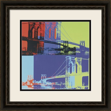
Warhol, for those readers that may have not been around during the early pop art movement, was born in the 1920's and died in the winter of 1987. His work was renowned the world over. The colorful, iconic images that he used helped to convey what was going on in pop culture, whether the activity was ultimately controversial or not. As such, his artwork often stirred strong feelings in fans and critics alike.
When decorating with pop art featuring Andy Warhol prints, there are several schools of thought to consider. For instance, some interior designers like to display Warhol’s art in areas that match the picture’s subject matter. Others prefer to put the artwork in unrelated, unexpected spots that help jolt viewers out of their rote activities. There are also those that focus more on the colors and patterns inherent in Warhol’s artwork than the actual subject matter.
 Take Andy Warhol’s Knives, c.1981-82 picture as an example. It could be hung up in a contemporary dining room or kitchen that has pops of black and cream coloring throughout. On the other hand, it could also be placed in a study or office with his series of Guns artwork and Skull, 1976 to show a love of mystery novels and forensic sciences.
There are other Andy Warhol prints on the market today that feature the artist’s quotes and images. One of our favorites is the one titled, Think Rich, Look Poor. It would look great on display in a bedroom changing area or walk-in closet. As would prints like It Takes a lot of Work to Figure Out How to Look So Good, Diamond Dust Shoes and Two Female Fashion Figures c. 1960.
To learn more about decorating with pop art featuring Andy Warhol, please contact us today. We have many prints of the artist’s work in stock as well as several other pop art prints of note.
Tags: abstract art, andy warhol, Art Gallery, Art Gifts, bright colors, Cities, contemporary art, contemporary decor, fine art, floral art, flowers, framed flower art, framed art, framed gifts, Fulcrum Gallery, fun art, Gifts, girls art, modern art, modern decor, pop art, spring colors, spring art, unique art, Wall Decor, framed pop art, framed Andy Warhol art, birthday, artists birthday, Andy Warhol pop art, colorful art, dining room art, kitchen art, interior design
Abstract Art | Pop Art | Featured Artist
by Fulcrum Gallery Staff
16. July 2014 15:14
Are you looking for art pieces that are classy and chic? They hold style and elegance and are perennially pleasing? Classy/chic art may not scream for attention but they draw you in with their understated charm. If you're looking to decorate with classy and chic art works, here are some pointers:
What’s Your Theme?
Do you have a theme in mind? You want a theme that withstands the test of time and doesn’t look jaded with the passing of time. Consider themes that are timeless – for instance, art pieces that celebrate the beauty of nature - flowers, plants, landscape, garden, seasons, or the beach. Bring the sun and surf into your house and allow the beach theme to dominate and transport you somewhere where breezes caress and the waves soothe.
Color Scheme
While there are no strict rules for color scheme for your home, some colors will withstand the whims and fancies of time better than others. For instance, psychedelic may be reminiscent of the 60's, where funk and bold collided in a surge of cultural beauty. If you’re decorating a space to reflect that time period, it will work well. However, if you’re striving to decorate a space that will still look classy with time, opt for colors that are more neutral. With a basic neutral color, you can then choose to play it up with a main color or an accent color. Choose art pieces that complement or contrast your basic room color.
 Style of the Artist
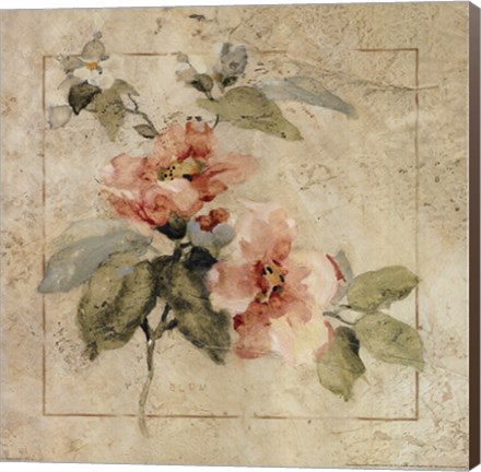
Perhaps you’re a fan of a particular artist. Their art works speak to you and feel most like you. Find a number of pieces and build a collage with them or use that one piece to define a room or space. For instance, Cheri Blum, an American painter uses simple lines and shapes to create a sense of peaceful balance in her art. Another popular impressionist artist, Barbara Mock, puts her strong sense of design to good use when creating pieces that capture floral theme, charming birdhouses or delicate teacups and whimsical landscapes. And what about the contemporary artist, Carol Robinson? She offers renditions of beach scene, kitchen décor and landscape with style and splendor. Because their art pieces are classy and chic, you may get more mileage out of them in the long run.
For more information on how you can use art pieces that are both chic and classy, feel free to contact us.
Tags: abstract art, Art Gifts, art on canvas, art print, art prints, bathroom art, fine art, Floral Art, flowers, food art, Gifts, guest house decor, guest room decor, kitchen art, kitchen decor, sale, Carol Robinson art, classy art, chic art, Barbara Mock art, Cheri Blum art, flower art on canvas, kitchen art on canvas, classy art on canvas, chic art on canvas, nature art
Abstract Art | Chic | Shabby Chic
by Fulcrum Gallery Staff
12. June 2014 16:08
Abstract art is an exciting form of contemporary art that expresses independence and innovation. Popularized in the U.S. in the early 1900's by Pablo Picasso and other famous artists who challenged tradition, abstract art ranges in style from imagery that departs slightly from normal representation of objects and people to imagery that defies reality.
Often characterized by shapes, abstract art calls attention to lines and colors that evoke emotional responses and inner creativity. When viewing abstract art, the observer becomes involved on a personal (and often subconscious level) and is quite likely to see extremely varied scenes and images that just seem to pop-out.
Abstract art is said to mirror the ever-changing and highly technological aspects of post-modern society. On a very basic level, abstract art values the energy of subject matter over and above the physical form, which also complements new theories in Quantum Physics and even spirituality, from parallel dimensions to the practice of deep meditation.
In 2013, The North American Journal of Psychology published an article that explored the “Preference for Abstract Art According to Thinking Styles and Personality.” Researchers found that people who prefer abstract art over traditional art enjoy new things and are “particularly sensation seeking, open-minded, field-independent thinkers.” Those who preferred abstract art also showed a natural inclination toward abstract thinking and higher levels of enjoyment for new and unusual foods and music.
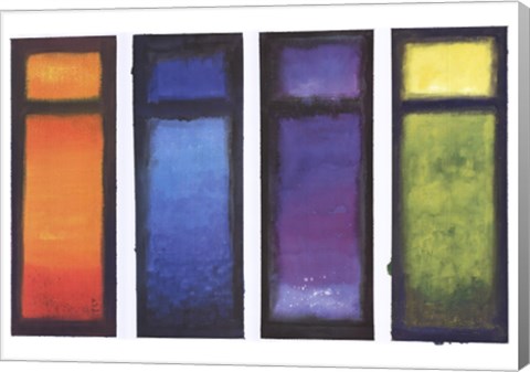
If you're open-minded and a free-thinker who doesn't believe everything is exactly how it seems, then abstract art is the ideal choice for home decoration to get your creative energy flowing. Consider the Four Meditations art print by Ian Scott Massie, which depicts gorgeous gradients of color and abstract windows that are sure to expand your senses. From reaching human arms to sea creatures, you're likely to find a myriad of images that speak to you over time with Peach Season 1 – Grande by Maureen Love, which highlights a minimalistic approach to create an earthy sort of inner chaos.
With uniquely modern hues, imprints of shapes, and the universal symbol of the circle, The Gathering Shore by Heather Ross would be an excellent abstract art statement piece for your living or dining room. For more examples of fine abstract art prints, visit Fulcrum Gallery online.
by Fulcrum Gallery Staff
24. February 2014 12:01
Anyone who spends much time contemplating modernist painting in a museum is bound to hear at least one passerby scoff. "This is worth how much? I could have painted that." Flipping through thumbnails of his color field paintings in an art history textbook, one might at first be tempted to shovel Mark Rothko into this category, but upon experiencing these great works in person, one begins to wonder anew: who was the person behind this body of work, and where did these images come from?
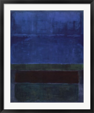
Born in Latvia in 1903, the Jewish-American painter we know as Mark Rothko immigrated to the United States in 1913 as a result of his father's fear that his sons would be drafted into the Russian Army. They settled in Portland, Oregon, where young Marcus excelled in school, winning a scholarship to Yale University. Uncomfortable in this elitist environment, he never finished, but was later awarded an honorary degree. He eventually became an American citizen and changed his name from Marcus Rothkowitz to Mark Rothko to sound less Jewish, as a response to rising anti-Semitism as the Nazi party gained influence in Europe. After leaving Yale, Rothko subsequently found work in New York where he experienced the turning point into his career as a visual artist. Passing by the Art Students League, a figure drawing session caught his eye, and he began to take classes there and at the New York School of Design. Especially given the economic depression, his family was not supportive of Marcus's decision to become a professional artist, despite his beginning to gain respect within avant-garde art circles.
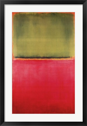
Rothko and other artists he associated with at the time feared that American painting had hit a wall, conceptually, becoming equated with the somewhat literal depiction of landscape and urban scenes. Even in this early work Rothko was interested in color as something that human beings respond to on a very basic level, beginning at a very young age. He believed that artistic clarity could be achieved through increasing levels abstraction, but his early work was still somewhat figurative. Rothko's interest in mythology and the writings of Nietzsche became a strong influence on his painting, beginning a quest to lessen the spiritual emptiness of the modern man.
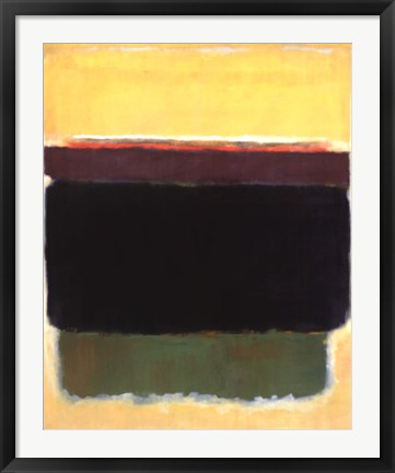
Mark Rothko began creating work in what we now consider to be his signature style in the late 1940s. These paintings, which critics termed "multiform paintings," featured rectangular fields of color on a large vertical canvas. Some criticized their large scale as an attempt to compensate for lack of content, to which Rothko replied that the scale was meant to allow the viewer to step close enough to feel part of the work itself. "I want to be very intimate and human. To paint a small picture is to place yourself outside your experience, to look upon an experience as a stereopticon view or with a reducing glass. However you paint the larger picture, you are in it. It isn’t something you command!"
by Fulcrum Gallery Staff
7. July 2013 15:48
It's almost a cliche in television and movies for a visitor confronted with abstract art to express their utter confusion and distaste at something that they not only don't understand themselves, but believe that no one in their right mind could comprehend it either. Are their passionately held and unwavering personal opinions a realistically accurate guide of the truth?
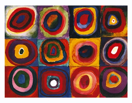
In 1910, the first original abstract art form was created by Wassily Kandinsky. Following that innovative development, in the early 1900's, some of the major developmental stages in the history of abstract art were developed. These developments included neo-plasticism, abstract expressionism, conceptual art, contemporary realism, photorealism, hyper realism, and neo-expressionism.
The three major forms of abstract art include cubism (Pablo Picasso and Georges), neoplasticism (Piet Mondrian), and abstract expressionism (Mark Rothko and Jackson Pollock). Popular varieties of abstract art today include abstract landscape art, 3D abstract art, and fantasy abstract.
It won't take you long to realize that utilizing abstract art is one of the most innovative and versatile ways to decorate your home or office. Abstract art offers many advantages, such as how easy it is to incorporate it into many different styles of interior design, particularly since it can be matched based upon colors. In fact, it's the wide range of colors used in abstract painting that makes it possible to change the color or feel of a room without having to replace the art on the walls. Interior designers are given the freedom to focus on creating a feel or general impression of a room rather than a specific motif.
Abstract art doesn't have to be the exclusive domain of a select group of self-proclaimed experts who say things like how a "particular piece embodies the contradictions inherent in existentialism while portraying the struggle of women's suffrage through color and shape". If you simply see a variety of shapes intermixed with colors in such a way that it strikes a chord in your imagination, and it ties a room together like nothing else could, then remember that abstract art and its appreciation belongs as much to you as to anyone else.
by Fulcrum Gallery Staff
30. April 2013 15:13
If you want your home to have a modern appeal with bold prints and intriguing patterns, you should be looking to all the new styles and colors available in abstract art. Whether your home is completely contemporary or has traditional accents, abstract art will definitely bring a splash of color to your living room, bathroom, bedroom, and kitchen. Consider these tips when you are planning to hang up abstract prints.
Make it Match Your Room
Your abstract piece should definitely match up to the styling of whichever room you decide to hang it in. If you have bright room, bring out its colors even more by hanging up an abstract art bursting with a variety of hues. Landscape No. 21 by Arthur Bernard mixes blue, white, red, and orange to create an interesting dreamy style, perfect for a light colored room. If you have a neutral toned room, you can spruce it up with a simple one or two colored abstract art, making it the focal point.
Create a Mini Gallery
If you have a large boring wall that you want to give personality, make an abstract art gallery. Have a big painting at the center of your gallery and hang up smaller art pieces around it. This will drawn in your guest’s eyes and definitely will garner many compliments. You can creatively do this by purchasing a photo collage frame that lives up to the abstract style.
Proportionate to Room
The size of your paintings should be proportionate to the space in the room. If the room is small, get medium sized to small prints to fill up an empty space. 8x20 pieces are the perfect selection for a guest room or bathroom. If the art is for the living room and you have plenty of space above the mantel, a 26x36 is an adequate size.
If you would love to fill up your home with a touch of modernism, check out our abstract art. We have a wide range of abstract circles, modern floral graphics and pop art to fulfill your artistic needs.