by Fulcrum Gallery Staff
17. October 2014 08:39
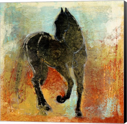
If you are a fan of abstract paintings, there is a good chance that you’ve at least heard of artist Maeve Harris. For those that have not heard of her, please allow us to make the introduction. She is a versatile, Seattle-based phenomenon that’s known for her intuitive use of organic forms and blending techniques. In addition, she tends to incorporate elements of photos, literature and history into her work. Here’s a look at several excellent examples of her innate talent:
Maeve Harris Collection: Moment Series
Maeve Harris’ Moment Series is a prime example of her brilliant use of brush strokes to create the illusion of movement. The paintings in the series are appropriately titled Moment I and Moment II. In both instances, she blends blacks, whites, yellows and browns to create two distinct, abstract focal points. Because of their abstract nature and coloring, the paintings could very easily be used in a variety of settings.
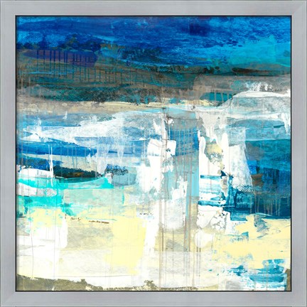
Maeve Harris Collection: Jetty & Crème Series
Understandably, Maeve Harris does not restrict her color palette to the ones found in the Moment Series. She has two series that would be ideal for use in beach homes or areas ripe with cool tones. Those two series are Jetty and Crème. Each abstract painting in the two series incorporates white and off white colors. The Jetty Series, however, also infuses those colors with shades of blue and green. As such, all four paintings would look wonderful paired with natural items like pressed seaweed, sand sculptures, bowls of beach glass and driftwood fragments.
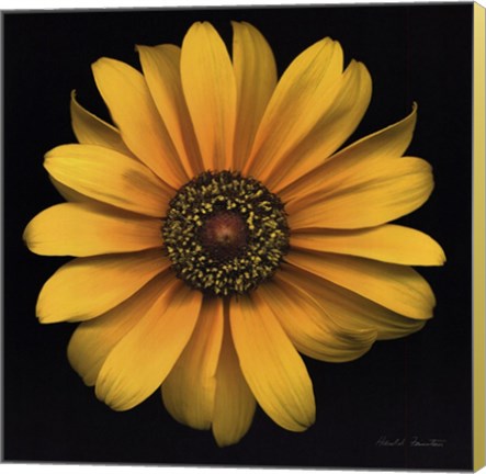
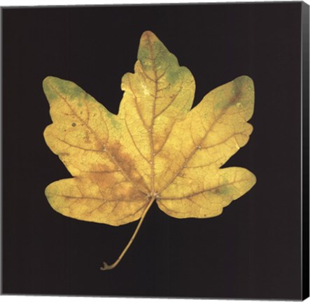
Maeve Harris Collection: Floral Paintings
No discussion of artist Maeve Harris’ work would be complete without a mention of her floral paintings. She has several collections that focus on flowers. Among the flowers highlighted in the various collections are marguerites, orchids, chiaroscuros and roses. Colors used in Harris’ floral paintings vary greatly. Therefore, it is easy to find one that will fit in with most design schemes.
Would you like to learn more about artist Maeve Harris and her exceptional paintings? If so, stop by the Fulcrum Gallery today.
Tags: Maeve Harris Art, Maeve Harris framed art, Maeve Harris art on canvas, canvas art, collections art, framed art, framed collections, abstract art, horse art, featured artist, animal canvas art, framed blue art, blue abstract artanimal gifts, Art Gallery, Art Gifts, bathroom decor, business decor, canvas abstract art, canvas gifts, canvas transfers, color trends, colorful art, contemporary art, contemporary decor, custom canvas, custom framed canvas, custom framing, custom gifts, customized gifts, decorating ideas, fine art, framed
Abstract Art | Animal Art | Featured Artist
by Fulcrum Gallery Staff
10. October 2014 08:20
Everyone loves popular color trends when they decide to remodel their home or renovate! It's fun to change your decor every once in a while to keep up with current popular color schemes. A very popular color for home decor, especially for this autumn season, is gold. Gold represents a meaning of success, achievement, and triumph. We often associate the color gold with money or wealth, but the color gold has so much more to tell us than just wealth. Many people have linked the color gold as a way to feel empowered and choose to think gold can give off a vibe of positive energy. Some also believe that gold can bring good wisdom, understanding, and enlightenment.
Represents a Meaning of Success, Achievement, and Triumph!
Often we see gold metals for the winner of a race so we connect the color gold and it's meaning to the winner's metal. This color draws attention to itself, it is eye-catching, passionate, and confident. Gold is a color that is often overlooked when choosing decor because of the flashy and wealthy vibe it shows. Decorating an office with gold art, or neutral colored prints with a gold frame, can give one a sense of empowerment and success. Getting gold art, art with a gold frame, or art on canvas with gold painted sides is not only suitable for your office. These will also raise your feeling of success in a library or study room.
Perfect Decor for Autumn Season!
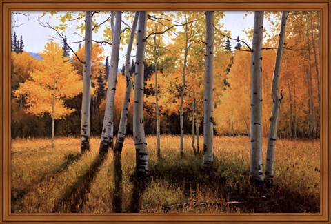
Not only is gold great decor for offices, classrooms, libraries, and study rooms, but it is also great for general home decor during autumn season! Decorating your home with paintings and photographs of golden autumn trees and the golden kissed sky during sunset is a great way to bring the beauty of autumn into your home with out having crunchy leaves. Gold autumn decor helps a room pop with color and come to life. Golden touched autumn art is especially a great decor choice for those who find themselves who favor autumn over other seasons. If autumn season is your favorite, why not leave the autumn decor up year round to keep your favorite season around!
Although gold is a popular color to decorate, you want to make sure to not overdo it. Having too much gold decor in your home can be overwhelming since gold is such a bold color. If the room is painted a solid color that compliments gold, just decorating with gold is perfectly fine! But remember, gold is a loud color that does not need help standing out and making a statement. Too much gold decor can ruin the statement you want to make. If done correctly, gold decor can be the perfect inspirational art, or the perfect seasonal art!
Tags: floral art, gold art, autumn art, success art, office art, library art, Art Gallery, Art Gifts, art on canvas, art print, art prints, autumn framed art, autumn gifts, black art, bright colors, business decor, canvas art, canvas gifts, canvas transfers, Color Photography, color trends, colorful art, Contemporary Art, contemporary decor, Contemporary Landscapes, Contemporary Tress, custom framing, custom canvas, decorating ideas, fine art, flower art on canvas, flowers, framed, framed gifts, Fulcrum Gallery, Gifts, home decor, home decorating, Inspirational Art, interior design, landscapes, season art, tree art, Wall Decor
Autumn | Featured Color Art
by Fulcrum Gallery Staff
26. September 2014 13:12
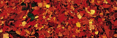
Fall is almost here! As the temperature drops and the days grow shorter, nature follows suit with a change of colors. Yellow, orange, gold, rust and red take over the landscape, diffusing autumnal spell. An irresistible spell. A spell you want to bring inside your home and spread the magic all around. Here’s how you can bring the colors of fall into your home:
Celebrate the Colors of Fall
Fall means the orange of pumpkin, the red of corn, yellow of gourds and the rust of fallen leaves. Often, they don’t come in one shade but myriads of shades and hues – a subtle yellow, a bold red or deep burgundy. Fall celebrate colors, perhaps nature’s way of cheering the beginning of colder weather. Fall colors are warm and inviting and what better way of duplicating these hues than inviting them into your home. How? By using fall art and prints that capture the essence of the season. For instance Bright Autumn Day showcases trees touched by the glow of orange and red while Autumn Embers captures a more subdued autumn. What you pick depends on the mood and feel you’re going for.
Celebrate the Season
In America, fall calls for celebration – pumpkin patch, hayrides, harvest fest, Halloween and Thanksgiving. Often, fall décor is employed to amp up the ambience. Apart from using pumpkins and gourds and fall flowers to build the atmosphere, consider using fall art and prints to add layers of interest. Transform the kitchen into an autumnal landscape of irresistible warmth and colors. Consider pictures of fall harvest such as playful Sharing the Harvest or thoughtful Harvest Blessings. Choices abound with pictures of wine, olives, prairie landscape and Tuscany harvest.
Celebrate Fall One Room at a Time
Think of how many ways you can use fall décor and how many places you can go with that. We’re talking rooms in your house. The kitchen may be the most obvious place to deck out fall décor but don’t limit your fall magic to just one room. Cozy up your family room with autumn flowers or autumn landscapes or abstract art. Or the living room or the den for that matter. Follow your fancy and allow fall magic to invade your living spaces.
Use art to celebrate fall in all its glories!
Tags: autumn art, red art, yellow art, black art, brown art, landscapes, nature, nature art, Art Gifts, art on canvas, art prints, art print, autumn canvas art, autumn gifts, canvas transfers, canvas gifts, Contemporary Art, Color Photography, colorful art, color trends, Fulcrum Gallery, fun art, home decor, Modern Art, Photography, photos, photos on canvas, scenic photography
Autumn
by Fulcrum Gallery Staff
28. February 2014 13:09
Looking to brighten up your home this spring? Need some fresh ideas for color pallets in your living room or bedroom? One way to reinvent the look of your home is to bring in new colors. Nothing will brighten up your winter blues like some bright new springtime colors on your walls. Here are some springtime colors for decorating your home that will freshen up any room.
One color trend that I like for the spring includes a dark evergreen with accents of different shades of pinks and whites. This color palette would work great in a living room or bedroom. Mixing a neutral color with pops of unexpected colors is one way to incorporate this color palette a room. With this color palette, the green is the neutral color and will not be overwhelming on your walls. The pops of pinks and whites can be incorporated with throw pillows, curtains, and wall art. It is important to remember to test a few shades of green on the wall before you paint your whole room. Dark colors on the wall can make the room darker or give the illusion that it is smaller than it actually is. Make sure to pick a color you are comfortable with.
Another color trend that I like for this spring is navy blue with teals and taupe. This trend is a little more complicated to pull off because you have to make sure to balance the lighter shades with some of the more rich dark colors of blues and teals. This color trend would work in a room where you can use an accent wall. In order to do this, a neutral taupe color for the walls would balance a floral navy blue pattern on an accent wall in the room. Adding teals and other blue-green shades into curtains, bedspreads, pillows, and art is what would make the room come together. To bring a more springtime feel into this look, I would use floral patterns for the accent wall or in the fabrics and art.
For more spring decorating tips or ideas that complement your decor, give us a call at 800-644-1278 or visit our website at http://fulcrumgallery.com.