by Fulcrum Gallery Staff
6. August 2014 10:34

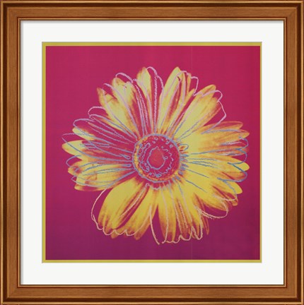
At its inception, the pop art movement brought relief to those that had grown tired of works created by abstract expressionists. From there, it went on to become one of the most popular art forms of the rebellious 50's and free-wheeling 60's. Today, designers’ passion for decorating with pop art featuring Andy Warhol helps to keep the love affair going.
Warhol, for those readers that may have not been around during the early pop art movement, was born in the 1920's and died in the winter of 1987. His work was renowned the world over. The colorful, iconic images that he used helped to convey what was going on in pop culture, whether the activity was ultimately controversial or not. As such, his artwork often stirred strong feelings in fans and critics alike.
When decorating with pop art featuring Andy Warhol prints, there are several schools of thought to consider. For instance, some interior designers like to display Warhol’s art in areas that match the picture’s subject matter. Others prefer to put the artwork in unrelated, unexpected spots that help jolt viewers out of their rote activities. There are also those that focus more on the colors and patterns inherent in Warhol’s artwork than the actual subject matter.
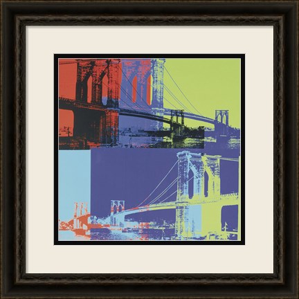
 Take Andy Warhol’s Knives, c.1981-82 picture as an example. It could be hung up in a contemporary dining room or kitchen that has pops of black and cream coloring throughout. On the other hand, it could also be placed in a study or office with his series of Guns artwork and Skull, 1976 to show a love of mystery novels and forensic sciences.
There are other Andy Warhol prints on the market today that feature the artist’s quotes and images. One of our favorites is the one titled, Think Rich, Look Poor. It would look great on display in a bedroom changing area or walk-in closet. As would prints like It Takes a lot of Work to Figure Out How to Look So Good, Diamond Dust Shoes and Two Female Fashion Figures c. 1960.
To learn more about decorating with pop art featuring Andy Warhol, please contact us today. We have many prints of the artist’s work in stock as well as several other pop art prints of note.
Tags: abstract art, andy warhol, Art Gallery, Art Gifts, bright colors, Cities, contemporary art, contemporary decor, fine art, floral art, flowers, framed flower art, framed art, framed gifts, Fulcrum Gallery, fun art, Gifts, girls art, modern art, modern decor, pop art, spring colors, spring art, unique art, Wall Decor, framed pop art, framed Andy Warhol art, birthday, artists birthday, Andy Warhol pop art, colorful art, dining room art, kitchen art, interior design
Abstract Art | Pop Art | Featured Artist
by Fulcrum Gallery Staff
28. February 2014 13:09
Looking to brighten up your home this spring? Need some fresh ideas for color pallets in your living room or bedroom? One way to reinvent the look of your home is to bring in new colors. Nothing will brighten up your winter blues like some bright new springtime colors on your walls. Here are some springtime colors for decorating your home that will freshen up any room.
One color trend that I like for the spring includes a dark evergreen with accents of different shades of pinks and whites. This color palette would work great in a living room or bedroom. Mixing a neutral color with pops of unexpected colors is one way to incorporate this color palette a room. With this color palette, the green is the neutral color and will not be overwhelming on your walls. The pops of pinks and whites can be incorporated with throw pillows, curtains, and wall art. It is important to remember to test a few shades of green on the wall before you paint your whole room. Dark colors on the wall can make the room darker or give the illusion that it is smaller than it actually is. Make sure to pick a color you are comfortable with.
Another color trend that I like for this spring is navy blue with teals and taupe. This trend is a little more complicated to pull off because you have to make sure to balance the lighter shades with some of the more rich dark colors of blues and teals. This color trend would work in a room where you can use an accent wall. In order to do this, a neutral taupe color for the walls would balance a floral navy blue pattern on an accent wall in the room. Adding teals and other blue-green shades into curtains, bedspreads, pillows, and art is what would make the room come together. To bring a more springtime feel into this look, I would use floral patterns for the accent wall or in the fabrics and art.
For more spring decorating tips or ideas that complement your decor, give us a call at 800-644-1278 or visit our website at http://fulcrumgallery.com.