Springtime Color Trends That Will Brighten Your Home

by Fulcrum Gallery Staff 28. February 2014 13:09

    Looking to brighten up your home this spring? Need some fresh ideas for color pallets in your living room or bedroom? One way to reinvent the look of your home is to bring in new colors.  Nothing will brighten up your winter blues like some bright new springtime colors on your walls. Here are some springtime colors for decorating your home that will freshen up any room.

    One color trend that I like for the spring includes a dark evergreen with accents of  different shades of pinks and whites.  This color palette would work great in a living room or bedroom.  Mixing a neutral color with pops of unexpected colors is one way to incorporate this color palette a room.  With this color palette, the green is the neutral color and will not be overwhelming on your walls.  The pops of pinks and whites can be incorporated with throw pillows, curtains, and wall art.  It is important to remember to test a few shades of green on the wall before you paint your whole room.  Dark colors on the wall can make the room darker or give the illusion that it is smaller than it actually is.  Make sure to pick a color you are comfortable with.

 Erin Clark Tulip Fresco (green)

     Another color trend that I like for this spring is navy blue with teals and taupe.  This trend is a little more complicated to pull off because you have to make sure to balance the lighter shades with some of the more rich dark colors of blues and teals.  This color trend would work in a room where you can use an accent wall.  In order to do this, a neutral taupe color for the walls would balance a floral navy blue pattern on an accent wall in the room.  Adding teals and other blue-green shades into curtains, bedspreads, pillows, and art is what would make the room come together.  To bring a more springtime feel into this look, I would use  floral patterns for the accent wall or in the fabrics and art.

Wani Pasion Into the Blue

For more spring decorating tips or ideas that complement your decor, give us a call at 800-644-1278 or visit our website at http://fulcrumgallery.com.

Mark Rothko: The man behind the rectangles

by Fulcrum Gallery Staff 24. February 2014 12:01

Anyone who spends much time contemplating modernist painting in a museum is bound to hear at least one passerby scoff. "This is worth how much? I could have painted that." Flipping through thumbnails of his color field paintings in an art history textbook, one might at first be tempted to shovel Mark Rothko into this category, but upon experiencing these great works in person, one begins to wonder anew: who was the person behind this body of work, and where did these images come from?

 Mark Rothko Blue, Green and Brown

Born in Latvia in 1903, the Jewish-American painter we know as Mark Rothko immigrated to the United States in 1913 as a result of his father's fear that his sons would be drafted into the Russian Army. They settled in Portland, Oregon, where young Marcus excelled in school, winning a scholarship to Yale University. Uncomfortable in this elitist environment, he never finished, but was later awarded an honorary degree. He eventually became an American citizen and changed his name from Marcus Rothkowitz to Mark Rothko to sound less Jewish, as a response to rising anti-Semitism as the Nazi party gained influence in Europe. After leaving Yale, Rothko subsequently found work in New York where he experienced the turning point into his career as a visual artist. Passing by the Art Students League, a figure drawing session caught his eye, and he began to take classes there and at the New York School of Design. Especially given the economic depression, his family was not supportive of Marcus's decision to become a professional artist, despite his beginning to gain respect within avant-garde art circles.

 Mark Rothko Green, Red, on Orange

Rothko and other artists he associated with at the time feared that American painting had hit a wall, conceptually, becoming equated with the somewhat literal depiction of landscape and urban scenes. Even in this early work Rothko was interested in color as something that human beings respond to on a very basic level, beginning at a very young age. He believed that artistic clarity could be achieved through increasing levels abstraction, but his early work was still somewhat figurative. Rothko's interest in mythology and the writings of Nietzsche became a strong influence on his painting, beginning a quest to lessen the spiritual emptiness of the modern man.

 Mark Rothko Untitled, 1949

Mark Rothko began creating work in what we now consider to be his signature style in the late 1940s. These paintings, which critics termed "multiform paintings," featured rectangular fields of color on a large vertical canvas. Some criticized their large scale as an attempt to compensate for lack of content, to which Rothko replied that the scale was meant to allow the viewer to step close enough to feel part of the work itself. "I want to be very intimate and human. To paint a small picture is to place yourself outside your experience, to look upon an experience as a stereopticon view or with a reducing glass. However you paint the larger picture, you are in it. It isn’t something you command!"

Rembrandt's reach into our time

by Fulcrum Gallery Staff 17. February 2014 12:55

Return of the Prodigal Son


Rembrandt is a mis-understood artist, but not in the conventional sense.  The people of his own time understood him rather well. . .it is subsequent generations who suffer from mis-information about his origins and his experiences. Although his history has recently emerged from the inaccuracies that abounded in the mid-20th century, it doesn't hurt to review the facts in light of the still-viewed movie, "Rembrandt" produced in London in the 1930's, and the possible conclusion that being an "old master" takes you off of the cutting edge of the current art scene.

Walter Wallace gives an excellent overview of Rembrandt's actual history in his book, "The World of Rembrandt."

("The Legend and the Man," in The World of Rembrandt: 1606-1669 ((Time-Life Library of Art)), Walter Wallace, New York, 1968, pp. 17-25)

Wallace expresses regret that the myth of a struggling, uneducated artist, an only child despised by those around him, traveling around the world only to find ruin, persists in the face of many scholarly attempts to set the record straight. Despite the popularity of the London movie staring Charles Laughton and Gertrude Lawrence, Rembrandt's reality was quite different.

There are recorded documents stating that Rembrandt's mother, upon her death, when the artist was 34 years old, left an estate of 10,000 florins in a time when a typical weaver might make about 1400 florins a year. So much for poverty.

His father was a miller, and in the liberated climate of the United Provinces, recently freed from Catholic Spain, it was not unthinkable that a miller's son could become a professional. So much for peasantry.

Other records tell us that Rembrandt was the eighth of nine children.  So much for being an only child.

While there are a few records of his siblings, Rembrandt was the only one that was sent to polish his skills. At the age of seven, Wallace tells us, he commenced a seven-year regimen that was to include:

". . . the reading of Cicero, Terence, Virgil, Ovid, Horace, Caesar, Sallust, Livy and Aesop. The students conversed in Latin, and Rembrandt became accustomed to the Latin form of his own name, Rembrantus Harmensis Leydensis (Rembrandt the son of Harmen of Leiden). It was for this reason that he signed his early works with the monogram, RHL. Rembrandt not only passed the course, but later recalled it in detail; his historical and mythological paintings reflect meticulous attention to the texts on which they were based."

When he turned to art, at the age of fourteen, he was apprenticed first to an unknown artist, then to Jacob Van Swanenburgh, where he learned the basics of painting, drawing and etching.

After three years, he was sent 30 miles away to Amsterdam to study under Pieter Lastman, a painter who had studied in Rome. Lastman painted historical scenes using vibrant color to depict the subjects accepted by the traditional norms of the Catholic Church (although Catholicism was increasingly driven underground in the United Provinces). Lastman himself had been greatly influenced by Caravaggio, who used light and shadow to produce emotion and mystery in painting. Lastman also studied Adam Elsheimer when he was in Rome.  Elsheimer was a German painter who used the Caravaggio technique to produce smaller detailed works.

After a short time with Lastman, Rembrandt, before the age of 20, established himself in his home town of Leiden as an independent master. It is very unlikely that he ever left his native country, although he did move to the larger city of Amsterdam, where he absorbed all the culture of a thriving artist community, and applied his education to the execution of his work.

So much for ignorance and wandering around Europe.

It is true, however, that Rembrandt experienced bankruptcy, but it wasn't for lack of customers or reputation regarding his competence. His "Night Watch" was fully appreciated by the public and honored by its commissioner. The Prince of Orange paid him an even greater sum a few years later for other artistic work. Rembrandt, it seems, had a problem managing his money, even though he had a rich wife; he found it difficult to resist investment in art, and he bought a bigger house than he could afford. And even though he produced many portraits of citizens and landscapes, he refused to totally succumb to "popular" values. He had some troubles with his in-laws, and his female servants, after his wife's death. These were the real reasons for his bankruptcy.

Wallace gives us a good picture of this era.  The United Provinces, sometimes referred to as "Holland," had won its independence from Spain and the Catholic Church during Rembrandt's early childhood.  Although the generous commissions from the Catholic Church were no longer available to artists, the population of this newly-liberated nation was hungry for art, and defined their own standards.  They liked visual realism, and since it was often the tradesmen and artisans that were the buyers, they wanted pictures of their own families and everyday circumstances. There were thousands of artists in this climate that were producing portraits and still life scenes for popular consumption at an astounding rate, which was one of the reasons that few of the artists died rich men.

The traditional custodian of "art" (specifically, the Church of Rome) demanded that history and religion be the highest and best use of artistic talent, and Rembrandt never rejected this perspective, always producing historic and religious scenes for the edification of his public. Even in his portrayals of his fellow citizens, his work was never devoid of humanitarian values, and an egalitarian view.  As the monied classes created by the House of Orange prospered, they preferred artists who portrayed them in a worldly sense. Rembrandt accepted these commissions, but probably made them think a little more than they would have liked. The foreign exploits of the Dutch were not glorified by their artists, perhaps because the nation's foreign accomplishments included harsh wars waged and debts incurred at the expense of their neighbors' lives and livelihoods.  

Rembrandt's first painting master, Jacob Van Swanenburgh, was known for his various examinations of Hell, but Rembrandt eschewed the use of fear, preferring instead to instill an appreciation of man's capacity for development of character and good use of the concept of love and honor. Throughout his works, which include over 2300 paintings, etchings, and drawings, there persists religious and historical references to remind us of the role and capacity of mankind that is present, in his view, in every individual.

"Young Woman with a Broom" which resides in the National Gallery of Art in Washington, D.C. is a good example of his powerful reminder that every human soul has dignity. Instead of portraying the child as a defeated servant, she has the light of intelligence in her aspect, and she holds the broom as a musician might hold a cello, with the utilitarian bucket overturned and forgotten.

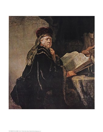
"The Rabbi," a subject that is without parallel for European controversy, condenses all of the issues into the mind, and then the face, of a man as he confronts a visitor.

Rabbi by Rembrandt van Rijn

Rembrandt's reach into our consciousness, and our consciences, continues with his full range of subject matter, from Dutch landscapes to Jesus on the cross to depictions of war to local gentry to Bathsheba reading David's letter. His command of art as a living platform to educate and inspire continues with undiminished power across the centuries.

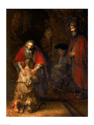
View our collection of Rembrandt artwork, including the popular "Return of the Prodigal Son" at http://fulcrumgallery.com.'

Vintage Movie Posters: They Don't Make 'Em Like That Anymore

by Fulcrum Gallery Staff 10. February 2014 10:35

Casablanca

What do you think of when you picture the following images?

Bogart and Bacall, cheek to cheek and staring outwardly in the same direction.

A menacing giant ape, angrily standing atop The Empire State Building, holding a beautiful woman in one hand and crushing an airplane in the other.

Audrey Hepburn, dressed in an elegant black evening gown, with a diamond tiara around her neck, and her silken hair in a bun.

If you're a big fan of classic films, you probably rattled off the titles Casablanca, King Kong, and Breakfast at Tiffany's without missing a beat. These are all iconic and indelible images that have been burned into our consciousness over time, because quite frankly, they are just stunning works of art. 

To the most passionate collectors of classic cinema memorabilia, the vintage poster is often the crown jewel of their personal treasure chest. In the past, the vintage poster was hard to find, as in the first half of the twentieth century, all promotional film materials were handled by The National Screen Service rather than the studios themselves. Then, after the run of a film was over, theaters nationwide were required to return the poster. In effect, such a practice made film posters nearly impossible to find. Additionally, there is a certain beautifully raw quality to the artwork and color scheme of such a poster that has somewhat disappeared from the promotional landscape as the digital world has taken hold of advertising. This also has added to the collectible nature of such posters.

Picture this. You've just gotten an spectacular new television, with the ultimate in both picture and sound. Your home theater is just about complete, all you need now is some cool, retro artwork to turn your once bland walls into an ultra-cool cinema Hall Of Fame. At FulcrumGallery.com, film buffs can find hundreds of memorable vintage movie posters at terrific prices. We invite you to check out our online gallery, and hopefully you'll find everything you need to help your collection of vintage movie posters flourish.

And also remember this when managing your collection. Today's hits are tomorrows vintage, so prepare accordingly.


FulcrumGallery

Visit our online store fulcrumgallery.com 

Homepage
FacebookPinterestTwitterGoogle PlusHouzz


We Encourage Stalking

Month List

Calendar

<<  April 2024  >>
MoTuWeThFrSaSu
25262728293031
1234567
891011121314
15161718192021
22232425262728
293012345

View posts in large calendar